Our work
Back to projects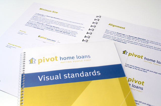
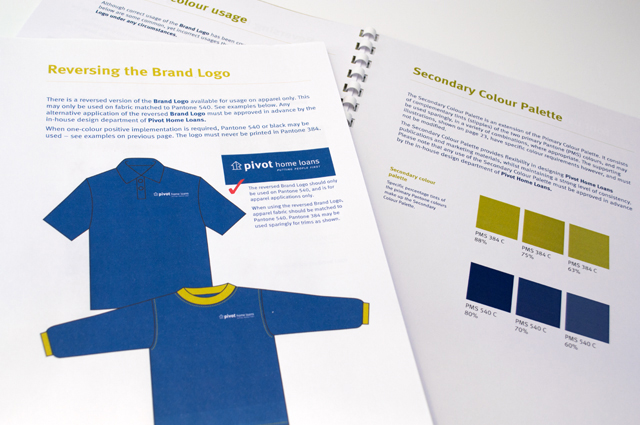
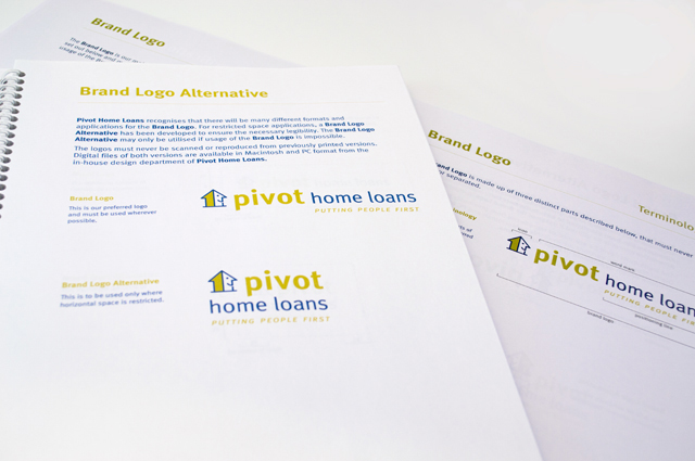
Pivot Home Loans identity
Responsible yet friendly. The Pivot Home Loans identity uses colours, fonts and graphics that don’t come from the standard financial institutions rule book. There is no point in creating a new brand that imitates the competition. Our comprehensive style guide documents and illustrates branding, signage, communications advertising and uniforms; the complete story for bringing this new company to life.
Other work
-

Chick cosmetics
The mid-teen, street and surf group are a fussy, fussy bunch. To simply call this […]
VIEW PROJECT -
Queen Elizabeth Centre
The Queen Elizabeth Centre provides support, care and education to families. Describing this important goal […]
VIEW PROJECT -
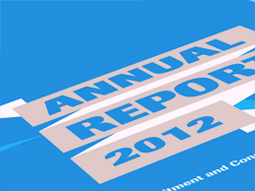
RCSA annual report
Annual reports are the opportunity to push the established look of an organisation beyond the […]
VIEW PROJECT -
Nadavoc hand-assembling service
Nadavoc creates work for people with disabilities. To engage potential clients with this unique organisation, […]
VIEW PROJECT