Our work
Back to projects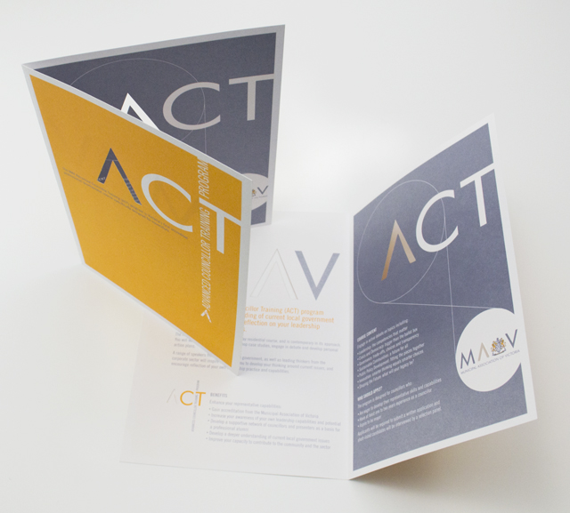
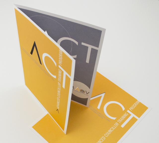
ACT flyer
Typography is often an under utilised element in pieces of communication. Making more of the words on paper builds-in their meaning and purpose. Creating the identity for a program in this way also reduces the need for additional elements. The pièce de résistance was forme cutting the A graphic through both pages. This delivered a strong character for this piece that reinforces the A’s recurring presence through the suite of documents we have created for the MAV.
Other work
-
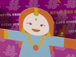
Worldly Weddings exhibition
The idea of paper dolls combines with our signature in-house illustration style to make a […]
VIEW PROJECT -
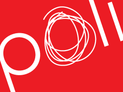
Polish consulting
A logograph is the visual representation of a word. For the Polish identity, this technique […]
VIEW PROJECT -
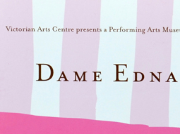
Dame Edna book
There is style and glamour, and then there is Dame Edna. Telling the Edna story […]
VIEW PROJECT -

Sponge natural cosmetics
A pure and clean experience with the authority of research is the promise of this premium […]
VIEW PROJECT