Our work
Back to projects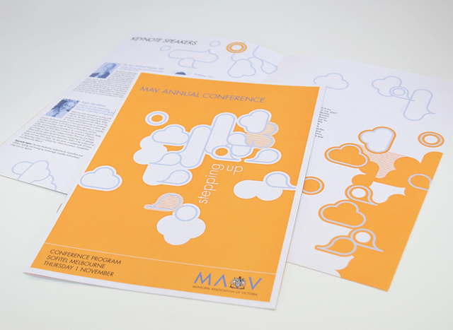
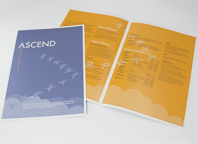
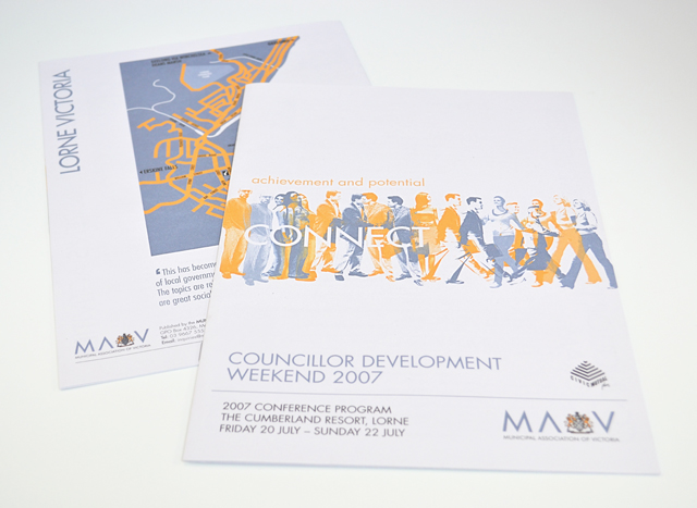
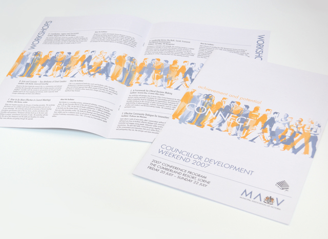
MAV publications suite
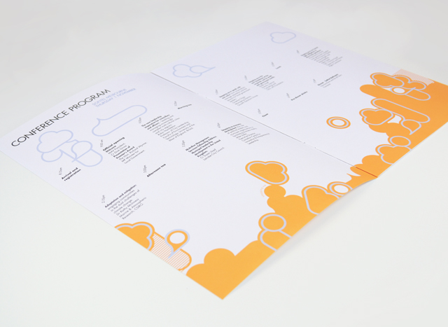
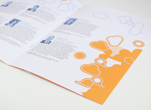
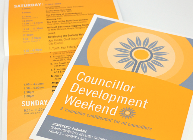
Use of two colours and bold graphics made a varied suite of printed material a unified group. We created strong vector elements to inject interest in corporate collateral promoting professional development programs, conferences and initiatives. Concentrating on yellow and silver blue, this unusual approach to corporate communications took tight timing and scarce photographic resources out of the equation, creating an identity with a bold graphic language.
Other work
-

Frogwood Arboretum
Graphically communicating your organisations name can work strongly for you. People appreciate being engaged with […]
VIEW PROJECT -
Moving announcement book
For this change of address announcement for Bambra Press, we decided to tell a story. […]
VIEW PROJECT -

Watershed carwash café
Creating an identity for a carwash that wanted to bring the café part of the […]
VIEW PROJECT -

Pivot Home Loans identity
Responsible yet friendly. The Pivot Home Loans identity uses colours, fonts and graphics that don’t […]
VIEW PROJECT