Our work
Back to projects
Queen Elizabeth Centre
The Queen Elizabeth Centre provides support, care and education to families. Describing this important goal visually within the identity, helps clients and staff to connect with the organisation. The visual identity captures a unique and positive character.
Other work
-

ACT flyer
Typography is often an under utilised element in pieces of communication. Making more of the […]
VIEW PROJECT -
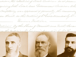
125 Years of the MAV
Opening up the safe revealed the treasures of the Municipal Association of Victoria. The maps, […]
VIEW PROJECT -

DSE annual report
Clean, clear sections with generous use of space create easy to find points of navigation […]
VIEW PROJECT -

Slumber Dry identity
We created an identity that develops a straightforward product further, to reassure the parents purchasing […]
VIEW PROJECT