Our work
Back to projects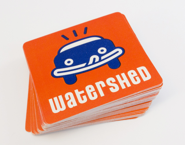
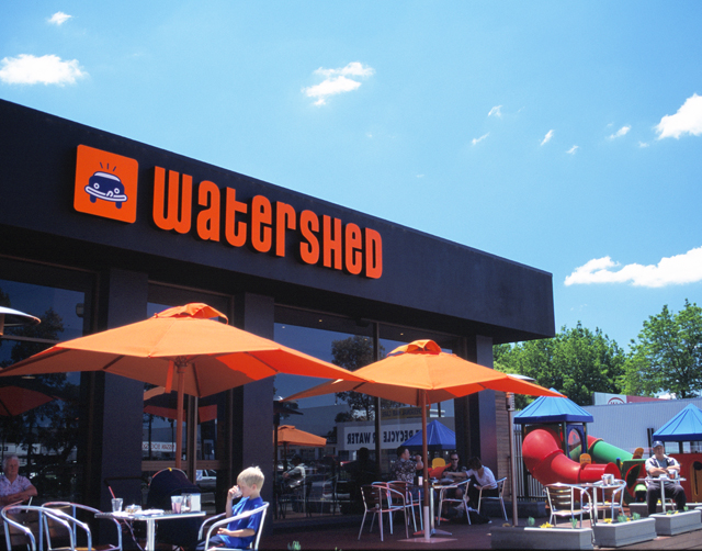
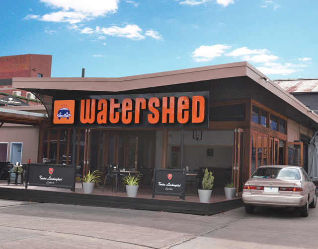
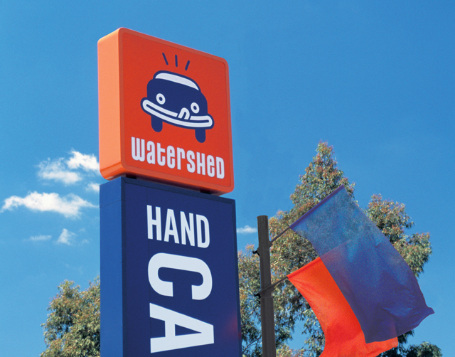
Watershed carwash café
Creating an identity for a carwash that wanted to bring the café part of the equation up a notch, without sacrificing the core of the business, led to the lip-smacking car icon. Watershed carwash café has since become a very successful and expanding franchise. Fresh use of type and colour is carried through collateral and signage. The icon is immediate in the recall of this brand by customers, creating a clear distinction from competitors in a tight market.
Other work
-
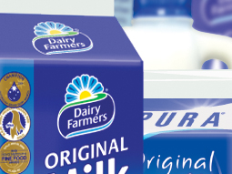
Range rollouts
Maintaining and extending established brands with new SKUs, new feature information and promotions requires a […]
VIEW PROJECT -

Arts Centre Melbourne Chookahs! Festival
Creating the atmosphere for an event, right from the audience members first contact, inspired this […]
VIEW PROJECT -

Spencer & Nash stationery
Visual identity for a boutique stationery maker. The modern yet elegantly detailed ethos of the […]
VIEW PROJECT -
Melbourne Water flood management strategy
Strong and beautiful photography was complimented with expansive areas of colour linked by a bold […]
VIEW PROJECT