Our work
Back to projects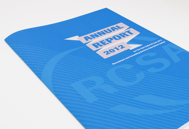
RCSA annual report
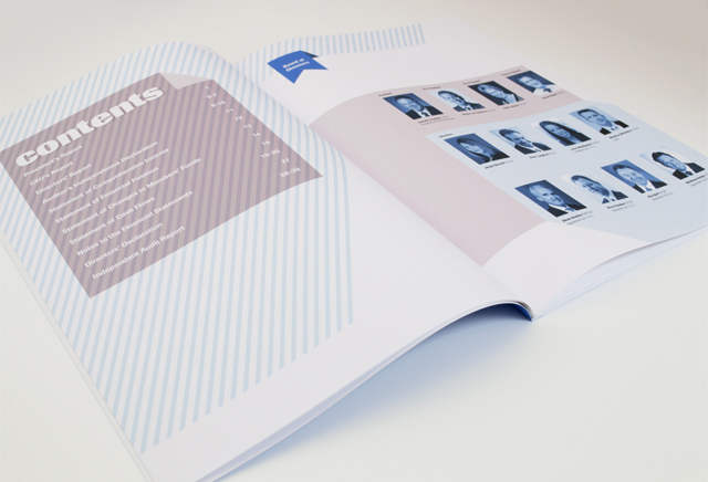
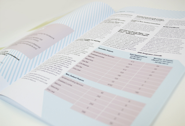
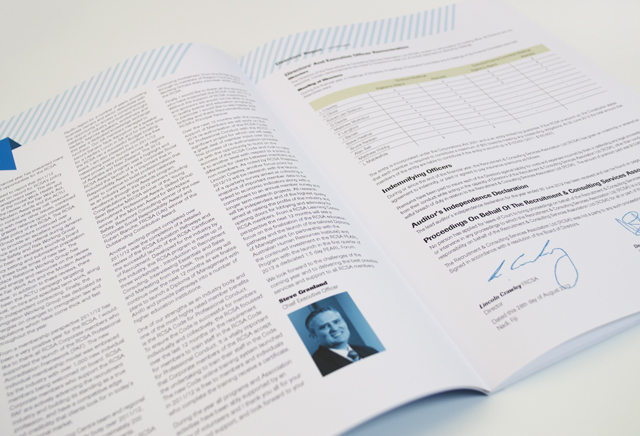
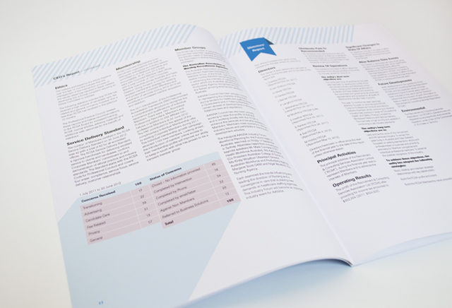
Annual reports are the opportunity to push the established look of an organisation beyond the limits of the style guide. When a direction for reinvigoration of the visual identity was requested by the client, we updated the established ribbon as a folding geometric device with accompanying stripe elements. Launching this new visual language with the annual report, the reader is engaged with fresh colour and more graphically based information that features text appropriately and communicates the organisation’s successes. The new identity offers a massive perception shift to the organisation’s members that can be built on and reinforced in future publications, stationery and signage.
Other work
-

Frogwood Arboretum
Graphically communicating your organisations name can work strongly for you. People appreciate being engaged with […]
VIEW PROJECT -

Westmoor Property identity
Colour can take a front seat without being overpowering. Employing a soft yellow to contrast […]
VIEW PROJECT -

Alex Fraser Group
Trucks are the most visible part of the company. We took an ever-present element, the […]
VIEW PROJECT -