
Our work
Back to projects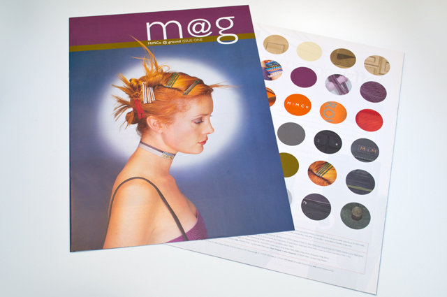
Mimco mag
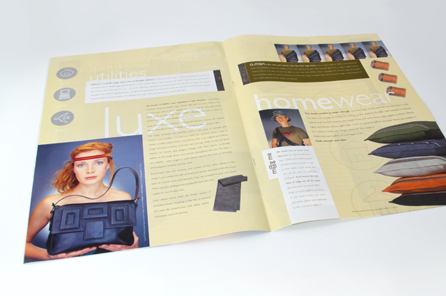
This publication contained a catalogue and was used as an introduction to the company at trade shows. Combining the right colours the right way was critical, especially for this audience. A generous use of space allows the product images to form the design of each page.
Other work
-

Australian Ballet Bodytorque
This program to engage supporters of the Australian Ballet, uses mesmerising images of the dancers […]
VIEW PROJECT -

Arts Centre Melbourne Chookahs! Festival
Creating the atmosphere for an event, right from the audience members first contact, inspired this […]
VIEW PROJECT -

Westmoor Property identity
Colour can take a front seat without being overpowering. Employing a soft yellow to contrast […]
VIEW PROJECT -

RCSA annual report
Annual reports are the opportunity to push the established look of an organisation beyond the […]
VIEW PROJECT