
Our work
Back to projects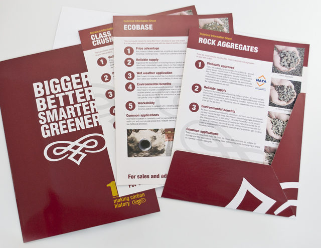
Alex Fraser Group
Trucks are the most visible part of the company. We took an ever-present element, the traditional pinstriping scroll on truck paintwork and made it their signature. Within an industry full of conventional geometric identities, a unique brand was created. For this long established civil construction supplier, the message of who they were and what the Alex Fraser Group offered, was best served with design that projected the strength of the organisation and its product, to its own people and its clients. The communication material we created built on the bold and simple graphics with straight talking, simple headlines for recruitment and sales promotion.
Other work
-

Moving announcement book
For this change of address announcement for Bambra Press, we decided to tell a story. […]
VIEW PROJECT -

-

Spencer & Nash stationery
Visual identity for a boutique stationery maker. The modern yet elegantly detailed ethos of the […]
VIEW PROJECT -
Melbourne Water flood management strategy
Strong and beautiful photography was complimented with expansive areas of colour linked by a bold […]
VIEW PROJECT