
Our work
Back to projects
Frogwood Arboretum
Graphically communicating your organisations name can work strongly for you. People appreciate being engaged with and informed efficiently. A friendly identity brands what was previously a cattle property, now being transformed into a forest of the world’s great trees.
Other work
-

Back to Action chiropractic
A strong, vital image for a sports-oriented chiropractic organisation.
VIEW PROJECT -

Arts Centre education programs
The extensive programs for schools offered by the Arts Centre Melbourne required clear, well defined […]
VIEW PROJECT -
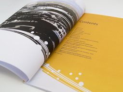
Melbourne Water flood management strategy
Strong and beautiful photography was complimented with expansive areas of colour linked by a bold […]
VIEW PROJECT -

Pivot Home Loans identity
Responsible yet friendly. The Pivot Home Loans identity uses colours, fonts and graphics that don’t […]
VIEW PROJECT