Our work
Back to projects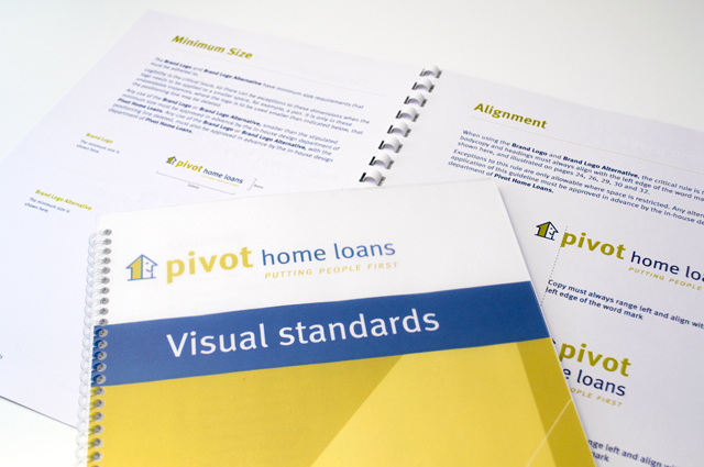
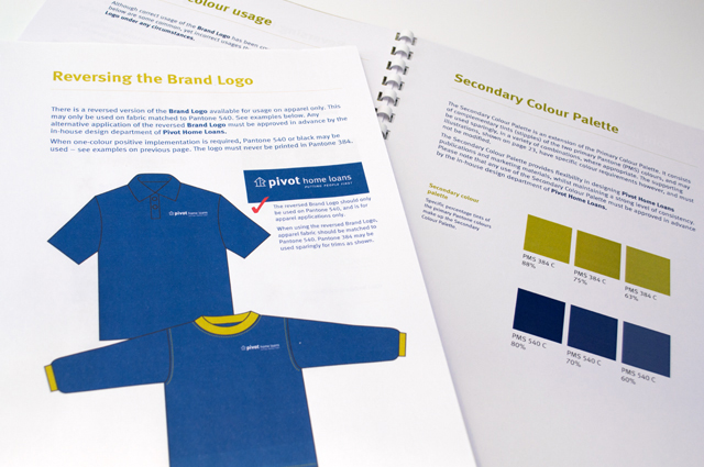
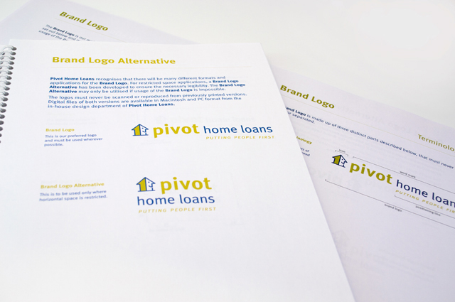
Pivot Home Loans identity
Responsible yet friendly. The Pivot Home Loans identity uses colours, fonts and graphics that don’t come from the standard financial institutions rule book. There is no point in creating a new brand that imitates the competition. Our comprehensive style guide documents and illustrates branding, signage, communications advertising and uniforms; the complete story for bringing this new company to life.
Other work
-

Slumber Dry identity
We created an identity that develops a straightforward product further, to reassure the parents purchasing […]
VIEW PROJECT -
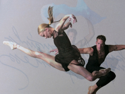
Australian Ballet Bodytorque
This program to engage supporters of the Australian Ballet, uses mesmerising images of the dancers […]
VIEW PROJECT -

Yoplait Go Gurt Socceroos
This healthy snack in a 6-pack reinvents its look to bring the excitement of a […]
VIEW PROJECT -

DSE annual report
Clean, clear sections with generous use of space create easy to find points of navigation […]
VIEW PROJECT