Our work
Back to projects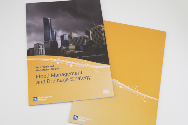

Melbourne Water flood management strategy
Strong and beautiful photography was complimented with expansive areas of colour linked by a bold recurring graphic edge of stylised water. This spacious layout makes what could have been a dry read into an appealing mix of history, social and economic planning.
Other work
-

Finance Market identity
The Finance Market brand uses the idea of money as its identity. The stylised graphic […]
VIEW PROJECT -

Alex Fraser Group
Trucks are the most visible part of the company. We took an ever-present element, the […]
VIEW PROJECT -

Queen Elizabeth Centre
The Queen Elizabeth Centre provides support, care and education to families. Describing this important goal […]
VIEW PROJECT -

Nadavoc hand-assembling service
Nadavoc creates work for people with disabilities. To engage potential clients with this unique organisation, […]
VIEW PROJECT