
Our work
Back to projects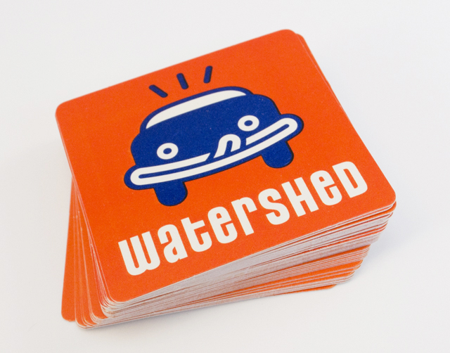
Watershed carwash café
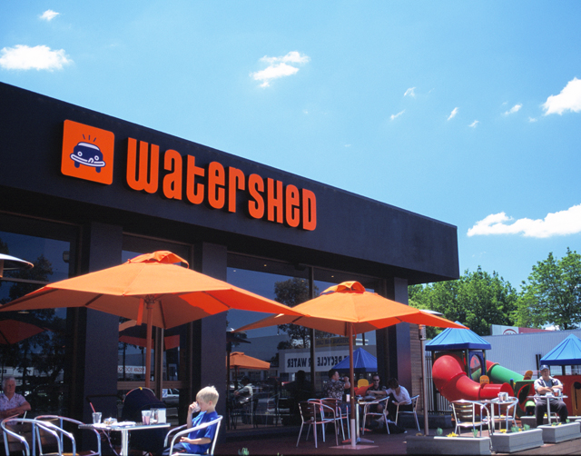
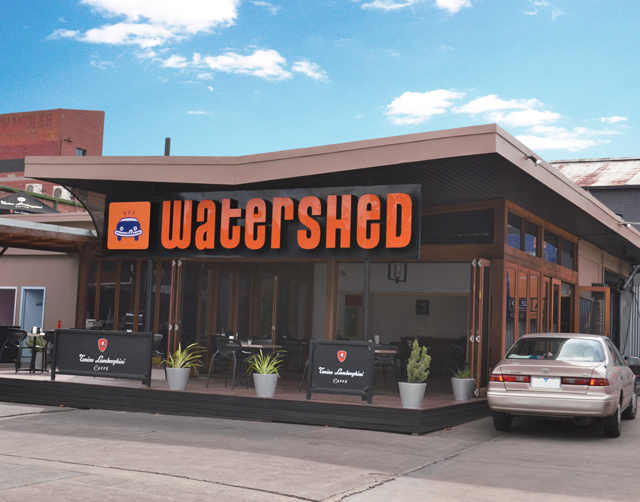
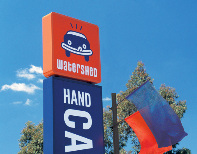
Creating an identity for a carwash that wanted to bring the café part of the equation up a notch, without sacrificing the core of the business, led to the lip-smacking car icon. Watershed carwash café has since become a very successful and expanding franchise. Fresh use of type and colour is carried through collateral and signage. The icon is immediate in the recall of this brand by customers, creating a clear distinction from competitors in a tight market.
Other work
-
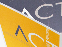
ACT flyer
Typography is often an under utilised element in pieces of communication. Making more of the […]
VIEW PROJECT -

Pivot Home Loans identity
Responsible yet friendly. The Pivot Home Loans identity uses colours, fonts and graphics that don’t […]
VIEW PROJECT -

Mimco mag
This publication contained a catalogue and was used as an introduction to the company at […]
VIEW PROJECT -
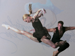
Australian Ballet Bodytorque
This program to engage supporters of the Australian Ballet, uses mesmerising images of the dancers […]
VIEW PROJECT