
Our work
Back to projects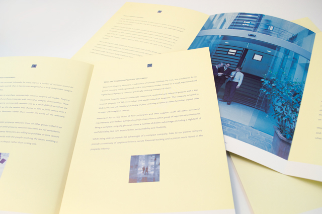
Westmoor Property identity
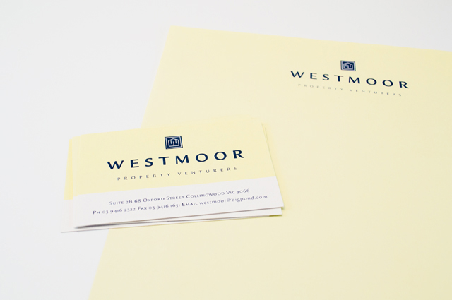
Colour can take a front seat without being overpowering. Employing a soft yellow to contrast with the strong logo device and type solution, delivers an identity that creates space between itself and the competition right from the outset. A conservative flamboyance.
Other work
-
Worldly Weddings exhibition
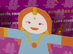
The idea of paper dolls combines with our signature in-house illustration style to make a […]
VIEW PROJECT -
Melbourne Water flood management strategy
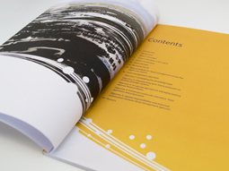
Strong and beautiful photography was complimented with expansive areas of colour linked by a bold […]
VIEW PROJECT -

Sinclair Walker identity
This sophisticated identity is based on the humble brick. Three colours offer the stationery set […]
VIEW PROJECT -
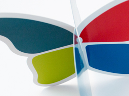
Queen Elizabeth Centre
The Queen Elizabeth Centre provides support, care and education to families. Describing this important goal […]
VIEW PROJECT