
Our work
Back to projects
HappyGreen identity
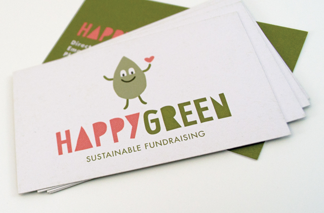
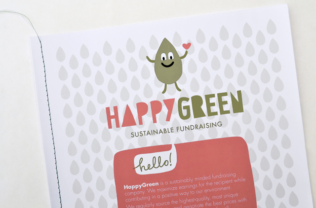
Presenting an approachable and friendly image are essential traits for retailers. When you add green credentials the image has to present those attributes in an even more carefully defined way. That doesn’t create a restriction; quite the opposite for HappyGreen. An incredibly simple hand drawn character and type solution brand this unique, sustainable fundraising initiative.
Other work
-
Yoplait Squeezie packaging
Distilling and presenting the most important elements in a consumer friendly design, we organised and […]
VIEW PROJECT -
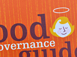
MAV Good Governance Guide
By injecting a healthy dose of personality, an extensive manual on governance is able to […]
VIEW PROJECT -
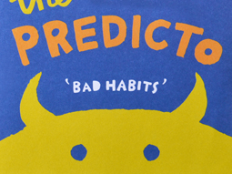
The Amazing Predicto
Lots of colour and a very simple hand drawn style are at the core of […]
VIEW PROJECT -

Westmoor Property identity
Colour can take a front seat without being overpowering. Employing a soft yellow to contrast […]
VIEW PROJECT