Our work
Back to projects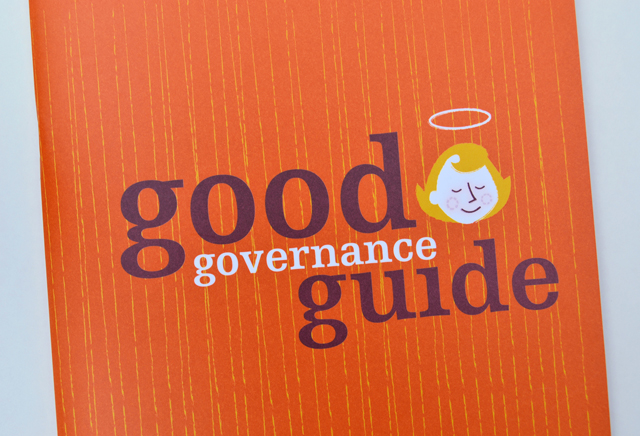
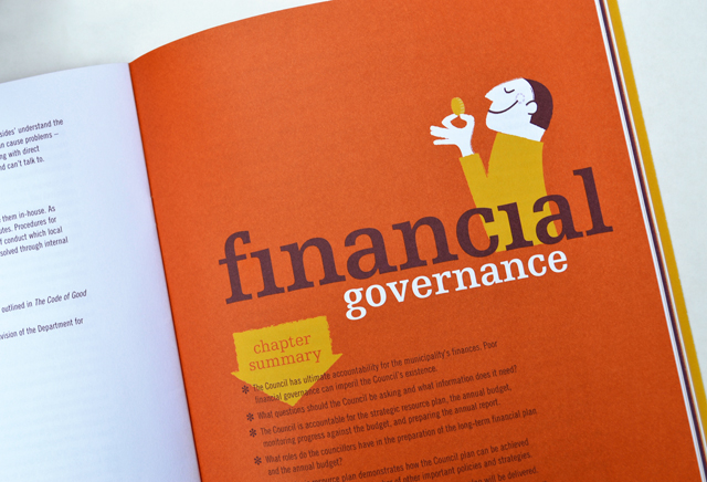
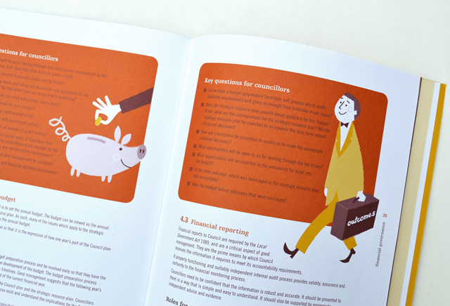
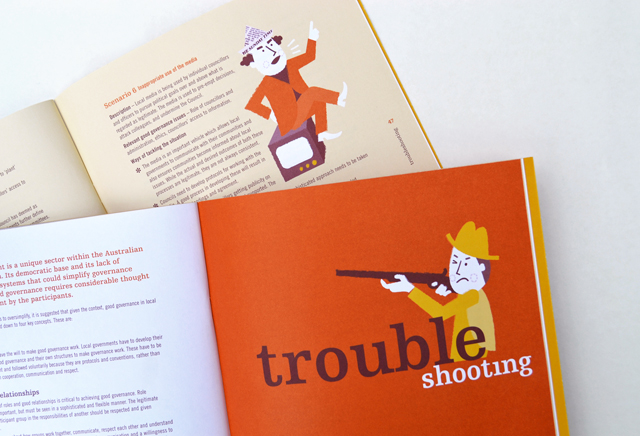
MAV Good Governance Guide
By injecting a healthy dose of personality, an extensive manual on governance is able to hold the reader, section after section, with refreshing original illustrative introductions and feature panels. These elements are partnered with typography that keep the information lively and accessible. High demand by members has led to several reprints of this publication.
Other work
-
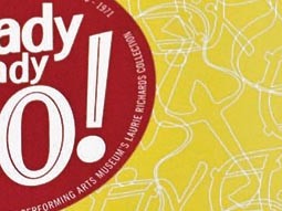
Arts Centre Ready Steady Go!
This fond glimpse at the early days of rock ’n’ roll in Australia, features the […]
VIEW PROJECT -
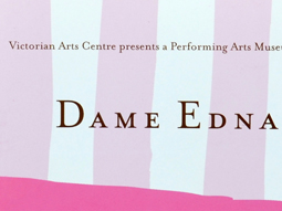
Dame Edna book
There is style and glamour, and then there is Dame Edna. Telling the Edna story […]
VIEW PROJECT -

Table Wrap events
Tablewrap organise and present unique and memorable events. This brochure, presented to their prospective clients, […]
VIEW PROJECT -

Arts Centre education programs
The extensive programs for schools offered by the Arts Centre Melbourne required clear, well defined […]
VIEW PROJECT