Our work
Back to projects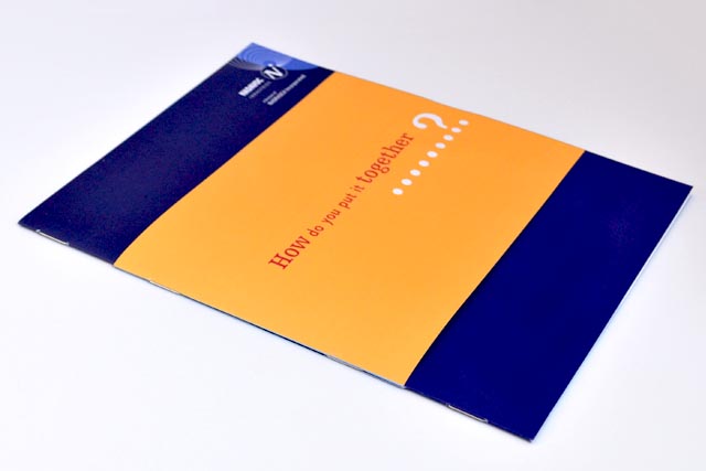
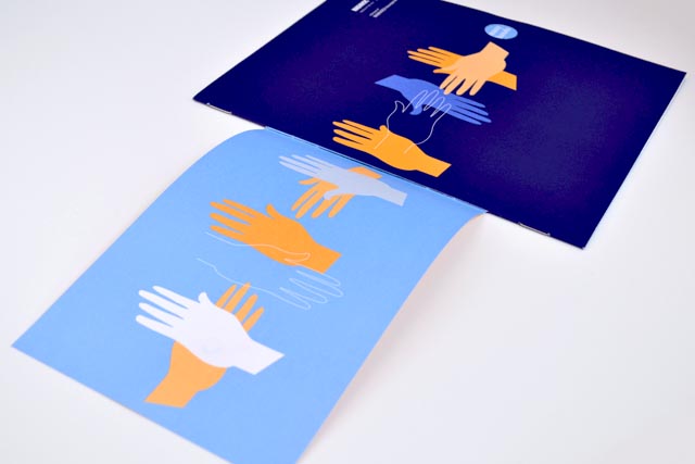
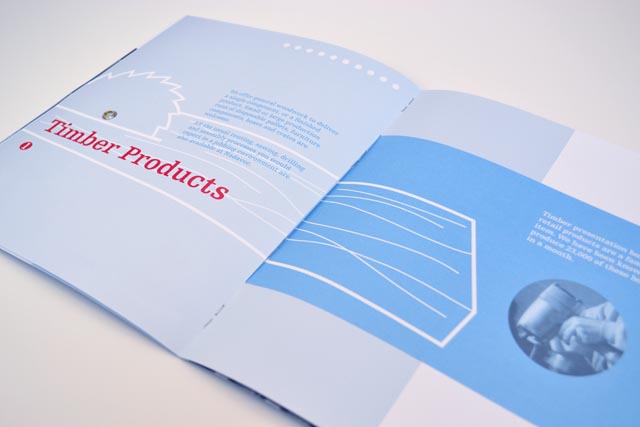
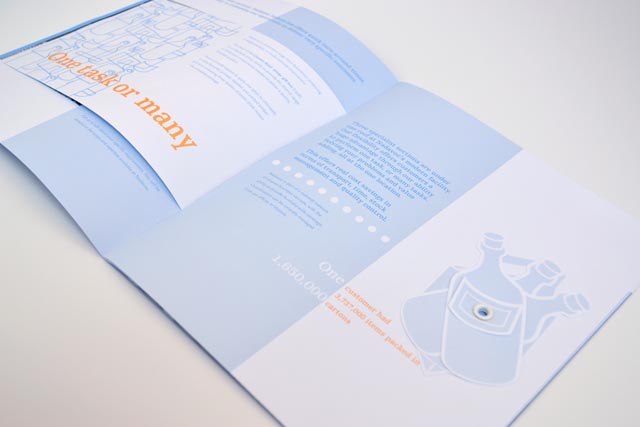
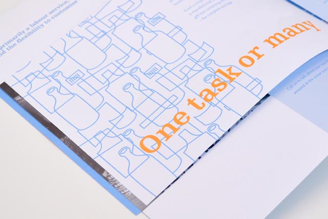
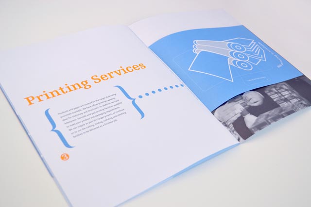
Nadavoc hand-assembling service
Nadavoc creates work for people with disabilities. To engage potential clients with this unique organisation, we side-stepped the usual corporate approach. A bold, sparse style allowed us to explore simple layouts that illustrate and demonstrate printing, assembly and woodwork; all services provided by Nadavoc. Each spread plays with forme-cutting, rivets and unusual collating; using short pages slotted through the full-size leaf; assembled in-house by the client. Sales and goodwill increased through this memorable and practical demonstration of capabilities.
Other work
-

Back to Action chiropractic
A strong, vital image for a sports-oriented chiropractic organisation.
VIEW PROJECT -
Bouncing Back booklet
Bouncing Back is designed for parents and children who have experienced family violence. The booklet […]
VIEW PROJECT -
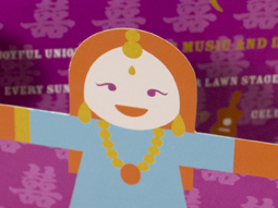
Worldly Weddings exhibition
The idea of paper dolls combines with our signature in-house illustration style to make a […]
VIEW PROJECT -

Mimco hair accessory packaging
A defined and distinctive style was developed for the packaging of this range of hair […]
VIEW PROJECT