Our work
Back to projects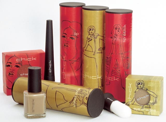
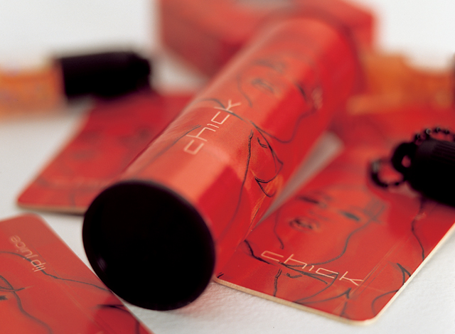
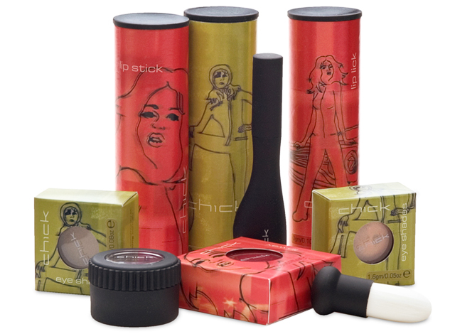
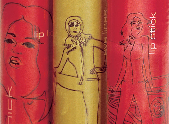
Chick cosmetics
The mid-teen, street and surf group are a fussy, fussy bunch. To simply call this niche, is to underestimate the value of getting the message right. We took the need for an original approach as far as designing a new card tube with end caps for the core range of packaging, that rolls through a counter display. A roughly produced base of colour under a traced-effect series of illustrations covers the tubes and boxes of the Chick range.
Other work
-
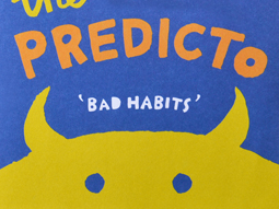
The Amazing Predicto
Lots of colour and a very simple hand drawn style are at the core of […]
VIEW PROJECT -
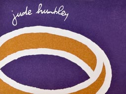
Goldsmith identity
Identities have a job to do. For this goldsmith producing bespoke jewellery, that story is […]
VIEW PROJECT -

Arts Centre Melbourne Chookahs! Festival
Creating the atmosphere for an event, right from the audience members first contact, inspired this […]
VIEW PROJECT -

Yoplait Star Wars tubs
This popular TV series is turned into the latest Yoplait brand. Each 6 pack features […]
VIEW PROJECT