Our work
Back to projects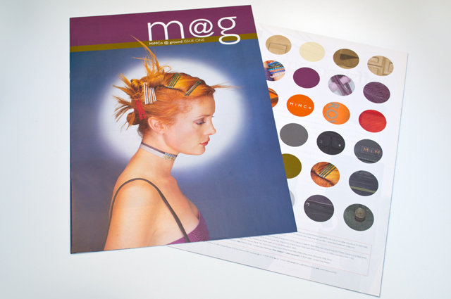
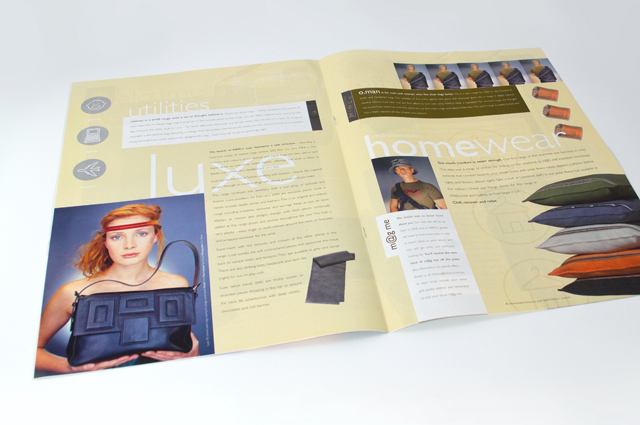
Mimco mag
This publication contained a catalogue and was used as an introduction to the company at trade shows. Combining the right colours the right way was critical, especially for this audience. A generous use of space allows the product images to form the design of each page.
Other work
-

Goldsmith identity
Identities have a job to do. For this goldsmith producing bespoke jewellery, that story is […]
VIEW PROJECT -

Sinclair Walker identity
This sophisticated identity is based on the humble brick. Three colours offer the stationery set […]
VIEW PROJECT -
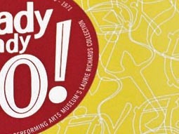
Arts Centre Ready Steady Go!
This fond glimpse at the early days of rock ’n’ roll in Australia, features the […]
VIEW PROJECT -

RCSA annual report
Annual reports are the opportunity to push the established look of an organisation beyond the […]
VIEW PROJECT