Our work
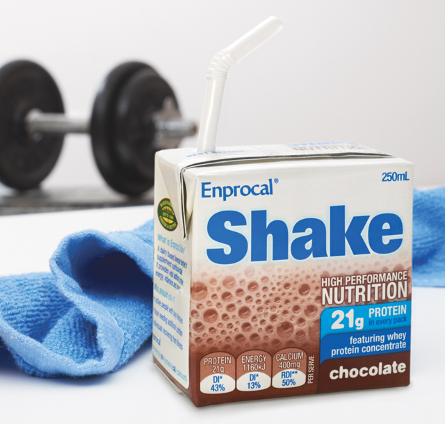
Back to projectsEnprocal shake
Designed for nutrition, this new brand needed to hit the right notes. Flavour is emphasised above other features to describe a tasty, healthy drink, that introduces a unique form of whey protein to the health market.
Other work
-

RCSA annual report
Annual reports are the opportunity to push the established look of an organisation beyond the […]
VIEW PROJECT -

MAV Good Governance Guide
By injecting a healthy dose of personality, an extensive manual on governance is able to […]
VIEW PROJECT -

Australian Ballet Bodytorque
This program to engage supporters of the Australian Ballet, uses mesmerising images of the dancers […]
VIEW PROJECT -

LGPro Awards books
Creating fresh themes about people and their achievements was the brief for these annual awards […]
VIEW PROJECT

