Our work
Back to projects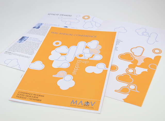
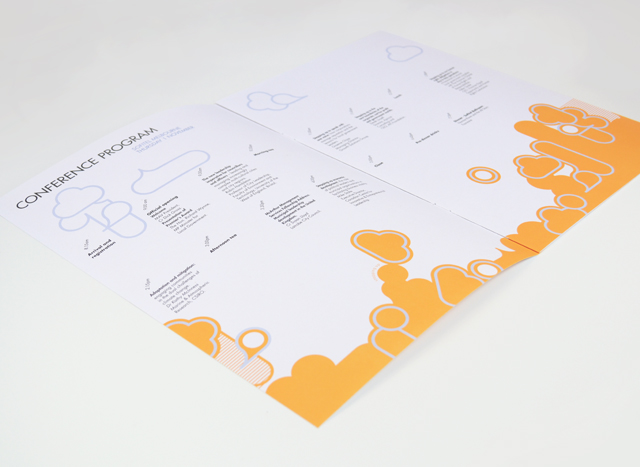
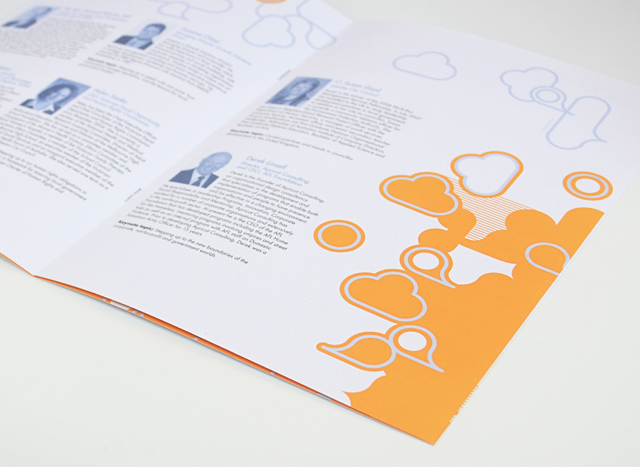
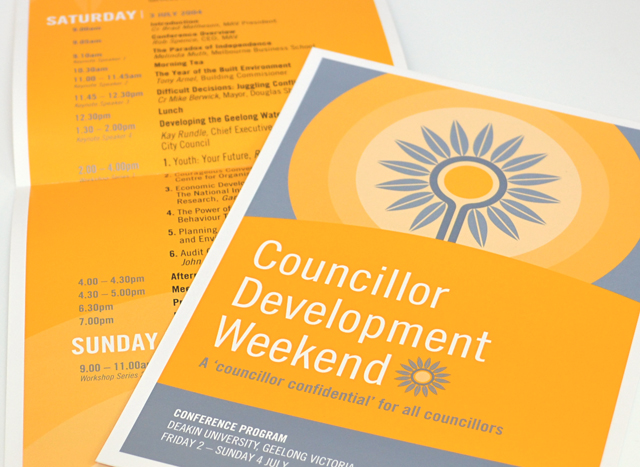
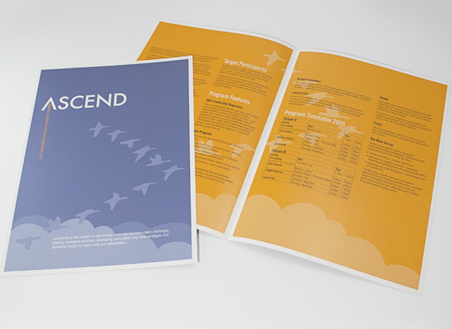
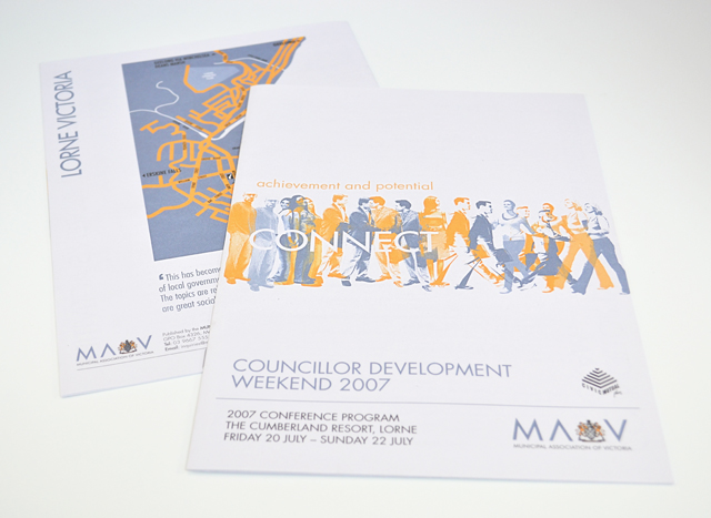
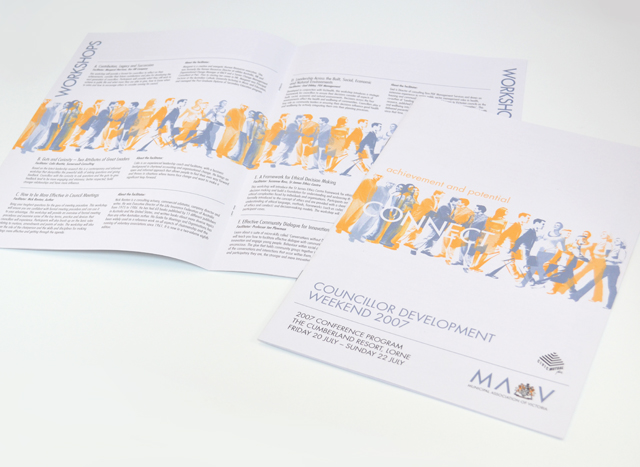
MAV publications suite
Use of two colours and bold graphics made a varied suite of printed material a unified group. We created strong vector elements to inject interest in corporate collateral promoting professional development programs, conferences and initiatives. Concentrating on yellow and silver blue, this unusual approach to corporate communications took tight timing and scarce photographic resources out of the equation, creating an identity with a bold graphic language.
Other work
-

Arts Centre Melbourne Chookahs! Festival
Creating the atmosphere for an event, right from the audience members first contact, inspired this […]
VIEW PROJECT -

Mimco mag
This publication contained a catalogue and was used as an introduction to the company at […]
VIEW PROJECT -

Arts Centre education programs
The extensive programs for schools offered by the Arts Centre Melbourne required clear, well defined […]
VIEW PROJECT -
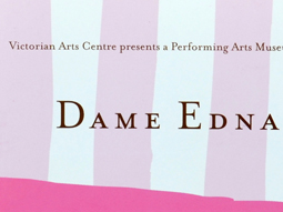
Dame Edna book
There is style and glamour, and then there is Dame Edna. Telling the Edna story […]
VIEW PROJECT