
Our work
Back to projects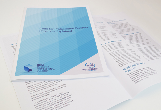
RCSA publications
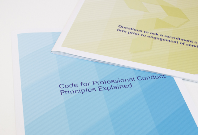
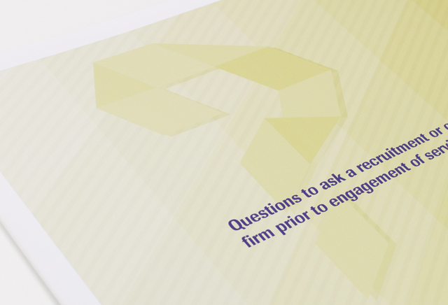
We did not use a light touch when it was time for an update to the corporate communications of this recruitment association. The client’s existing dated ribbon device was modernised into graphic shapes with graduated colour. These simple elements expanded into different graphic interpretations for a striking suite of documents. An annual report, code of practice booklet and industry brochures were also created, sharing this bright yet corporate look, moving perception of the organisation forward with a modern progressive energy.
Other work
-

MAV Good Governance Guide
By injecting a healthy dose of personality, an extensive manual on governance is able to […]
VIEW PROJECT -

Yoplait Squeezie packaging
Distilling and presenting the most important elements in a consumer friendly design, we organised and […]
VIEW PROJECT -

Big M on-pack promotions
This iconic brand maintains interest from existing and new customers through seasonal promotions. Instantly exciting consumers […]
VIEW PROJECT -
The Amazing Predicto
Lots of colour and a very simple hand drawn style are at the core of […]
VIEW PROJECT