
Our work
Back to projects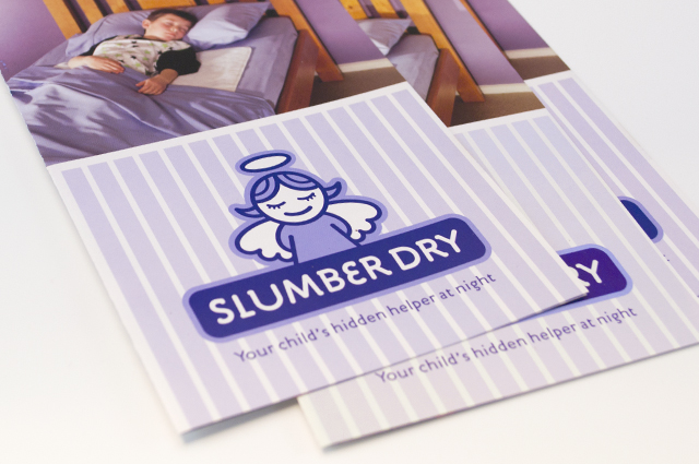
Slumber Dry identity
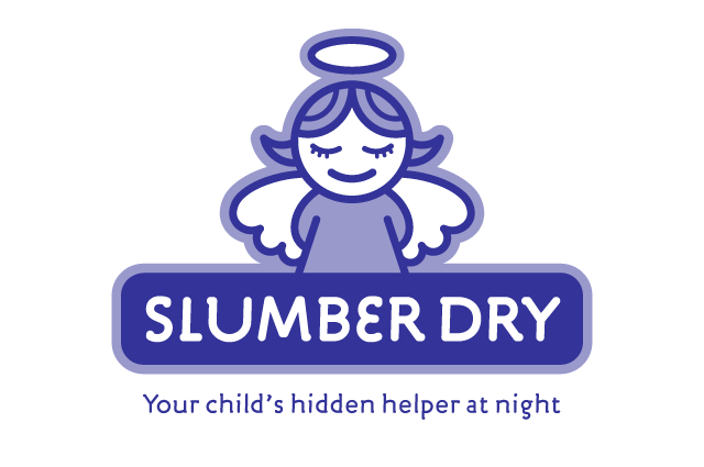
We created an identity that develops a straightforward product further, to reassure the parents purchasing it. A guardian angel captures this idea and creates a unique position for the brand, away from the less engaging clinical approach of the competition.
Other work
-
Nadavoc hand-assembling service
Nadavoc creates work for people with disabilities. To engage potential clients with this unique organisation, […]
VIEW PROJECT -
Sponge natural cosmetics
A pure and clean experience with the authority of research is the promise of this premium […]
VIEW PROJECT -
Arts Centre Melbourne Chookahs! Festival
Creating the atmosphere for an event, right from the audience members first contact, inspired this […]
VIEW PROJECT -
Pivot Home Loans identity
Responsible yet friendly. The Pivot Home Loans identity uses colours, fonts and graphics that don’t […]
VIEW PROJECT