Our work
Back to projects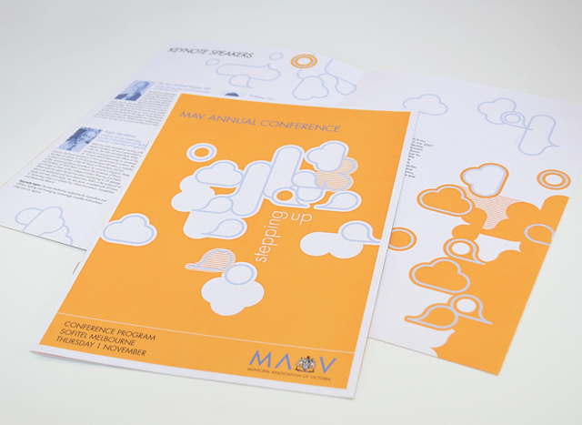
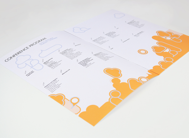
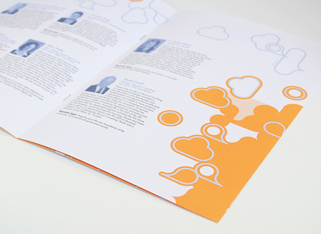
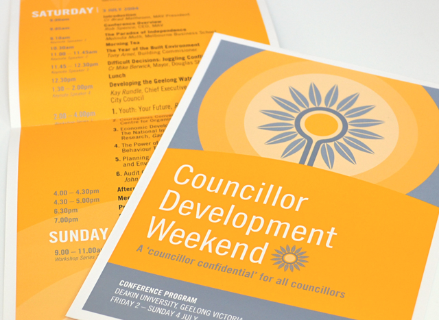
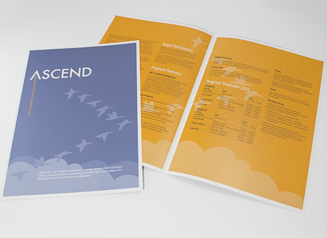
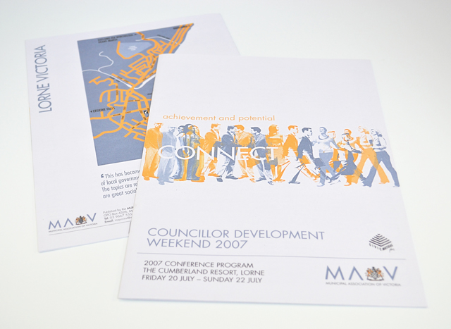
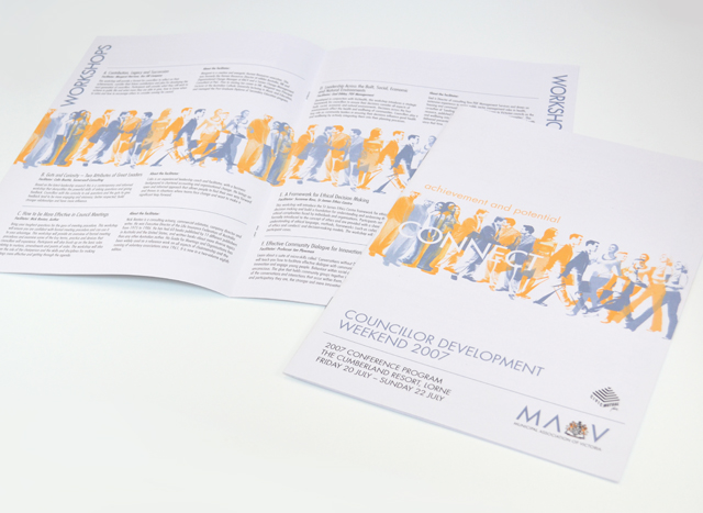
MAV publications suite
Use of two colours and bold graphics made a varied suite of printed material a unified group. We created strong vector elements to inject interest in corporate collateral promoting professional development programs, conferences and initiatives. Concentrating on yellow and silver blue, this unusual approach to corporate communications took tight timing and scarce photographic resources out of the equation, creating an identity with a bold graphic language.
Other work
-

Big M on-pack promotions
This iconic brand maintains interest from existing and new customers through seasonal promotions. Instantly exciting consumers […]
VIEW PROJECT -

Pivot Home Loans identity
Responsible yet friendly. The Pivot Home Loans identity uses colours, fonts and graphics that don’t […]
VIEW PROJECT -

Mimco mag
This publication contained a catalogue and was used as an introduction to the company at […]
VIEW PROJECT -

Bouncing Back booklet
Bouncing Back is designed for parents and children who have experienced family violence. The booklet […]
VIEW PROJECT