
Our work
Back to projects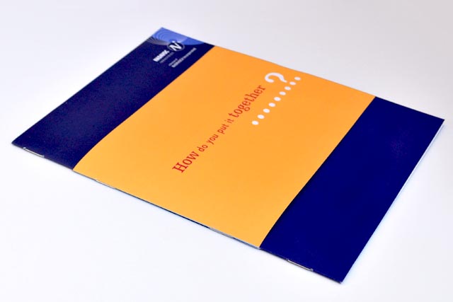
Nadavoc hand-assembling service
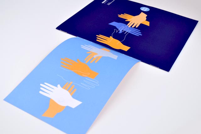
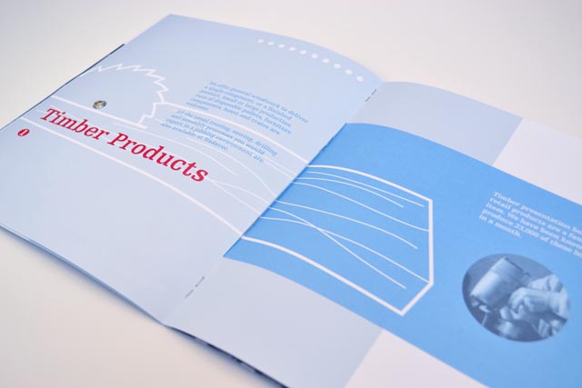
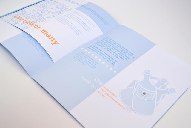
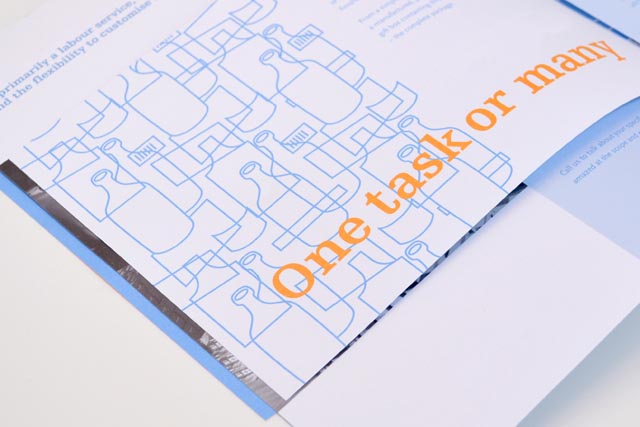
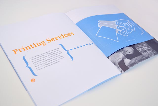
Nadavoc creates work for people with disabilities. To engage potential clients with this unique organisation, we side-stepped the usual corporate approach. A bold, sparse style allowed us to explore simple layouts that illustrate and demonstrate printing, assembly and woodwork; all services provided by Nadavoc. Each spread plays with forme-cutting, rivets and unusual collating; using short pages slotted through the full-size leaf; assembled in-house by the client. Sales and goodwill increased through this memorable and practical demonstration of capabilities.
Other work
-

Table Wrap events
Tablewrap organise and present unique and memorable events. This brochure, presented to their prospective clients, […]
VIEW PROJECT -

Alex Fraser Group
Trucks are the most visible part of the company. We took an ever-present element, the […]
VIEW PROJECT -

LGPro Awards books
Creating fresh themes about people and their achievements was the brief for these annual awards […]
VIEW PROJECT -

DSE annual report
Clean, clear sections with generous use of space create easy to find points of navigation […]
VIEW PROJECT