Our work
Back to projects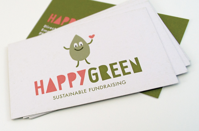
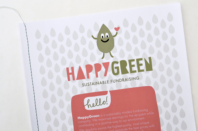
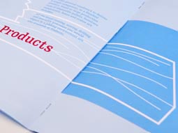
HappyGreen identity
Presenting an approachable and friendly image are essential traits for retailers. When you add green credentials the image has to present those attributes in an even more carefully defined way. That doesn’t create a restriction; quite the opposite for HappyGreen. An incredibly simple hand drawn character and type solution brand this unique, sustainable fundraising initiative.
Other work
-
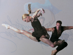
Australian Ballet Bodytorque
This program to engage supporters of the Australian Ballet, uses mesmerising images of the dancers […]
VIEW PROJECT -
Nadavoc hand-assembling service
Nadavoc creates work for people with disabilities. To engage potential clients with this unique organisation, […]
VIEW PROJECT -
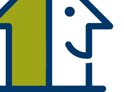
Pivot Home Loans identity
Responsible yet friendly. The Pivot Home Loans identity uses colours, fonts and graphics that don’t […]
VIEW PROJECT -