Our work
Back to projects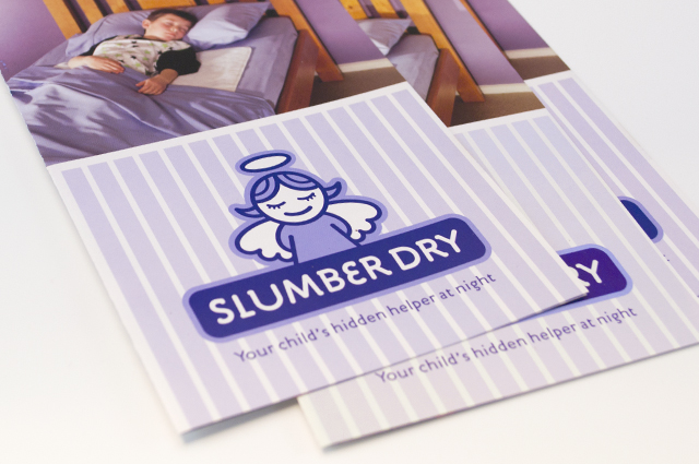
Slumber Dry identity
We created an identity that develops a straightforward product further, to reassure the parents purchasing it. A guardian angel captures this idea and creates a unique position for the brand, away from the less engaging clinical approach of the competition.
Other work
-

Alex Fraser Group
Trucks are the most visible part of the company. We took an ever-present element, the […]
VIEW PROJECT -

Arts Centre education programs
The extensive programs for schools offered by the Arts Centre Melbourne required clear, well defined […]
VIEW PROJECT -

Big M on-pack promotions
This iconic brand maintains interest from existing and new customers through seasonal promotions. Instantly exciting consumers […]
VIEW PROJECT -

Big M rotational flavours
Introducing new flavours adds energy and momentum to a well loved brand. To let consumers […]
VIEW PROJECT