Our work
Back to projects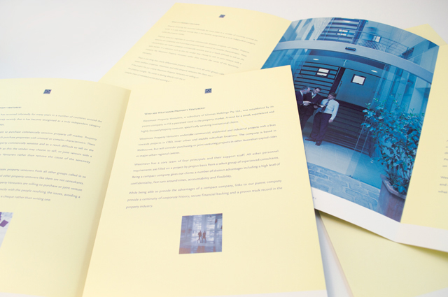
Westmoor Property identity
Colour can take a front seat without being overpowering. Employing a soft yellow to contrast with the strong logo device and type solution, delivers an identity that creates space between itself and the competition right from the outset. A conservative flamboyance.
Other work
-

Spencer & Nash stationery
Visual identity for a boutique stationery maker. The modern yet elegantly detailed ethos of the […]
VIEW PROJECT -

Mimco hair accessory packaging
A defined and distinctive style was developed for the packaging of this range of hair […]
VIEW PROJECT -
Yoplait Star Wars tubs
This popular TV series is turned into the latest Yoplait brand. Each 6 pack features […]
VIEW PROJECT -

Sinclair Walker identity
This sophisticated identity is based on the humble brick. Three colours offer the stationery set […]
VIEW PROJECT