Our work
Back to projects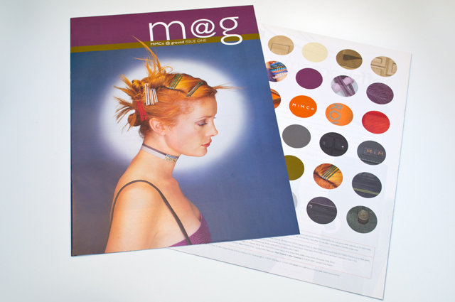
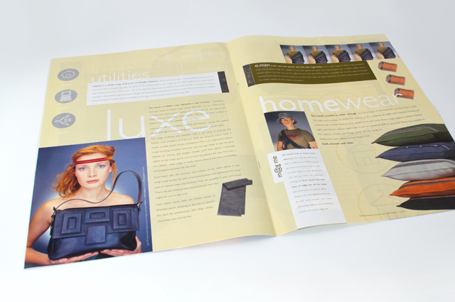
Mimco mag
This publication contained a catalogue and was used as an introduction to the company at trade shows. Combining the right colours the right way was critical, especially for this audience. A generous use of space allows the product images to form the design of each page.
Other work
-

DSE annual report
Clean, clear sections with generous use of space create easy to find points of navigation […]
VIEW PROJECT -

Back to Action chiropractic
A strong, vital image for a sports-oriented chiropractic organisation.
VIEW PROJECT -
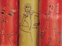
Chick cosmetics
The mid-teen, street and surf group are a fussy, fussy bunch. To simply call this […]
VIEW PROJECT -

LGPro Awards books
Creating fresh themes about people and their achievements was the brief for these annual awards […]
VIEW PROJECT