Our work
Back to projects
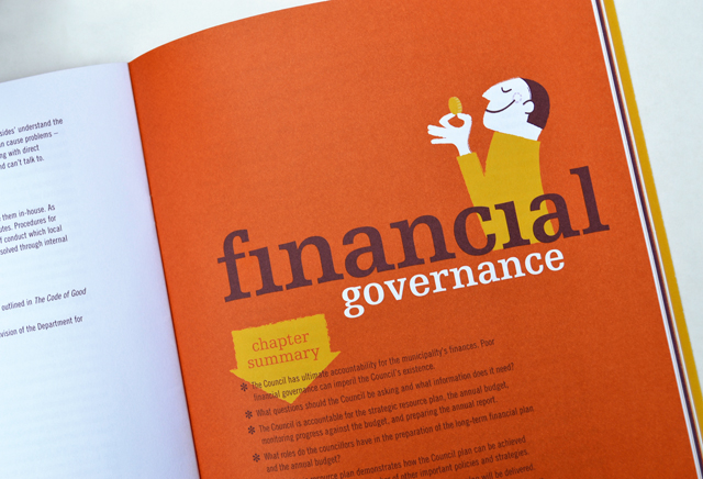
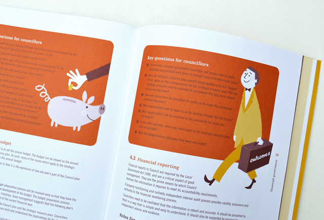
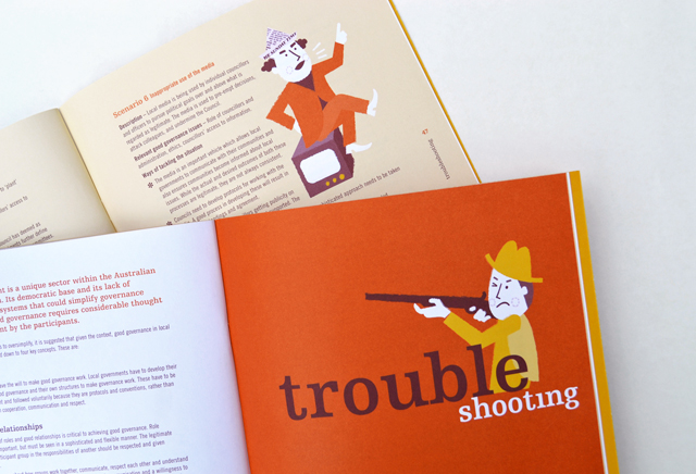
MAV Good Governance Guide
By injecting a healthy dose of personality, an extensive manual on governance is able to hold the reader, section after section, with refreshing original illustrative introductions and feature panels. These elements are partnered with typography that keep the information lively and accessible. High demand by members has led to several reprints of this publication.
Other work
-
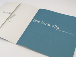
One Umbrella annual report
People working for other people was the focus of this annual report for a food […]
VIEW PROJECT -
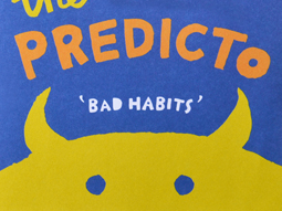
The Amazing Predicto
Lots of colour and a very simple hand drawn style are at the core of […]
VIEW PROJECT -
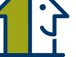
Pivot Home Loans identity
Responsible yet friendly. The Pivot Home Loans identity uses colours, fonts and graphics that don’t […]
VIEW PROJECT -
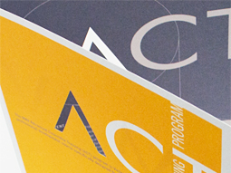
ACT flyer
Typography is often an under utilised element in pieces of communication. Making more of the […]
VIEW PROJECT