Our work
Back to projects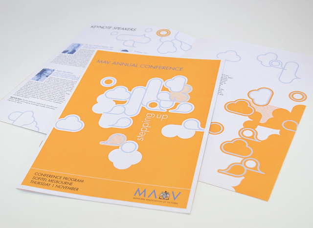
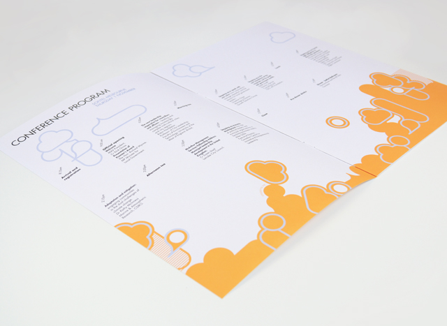
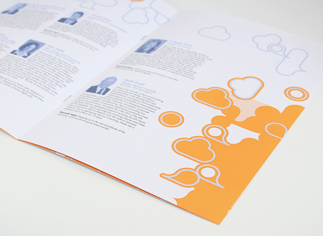
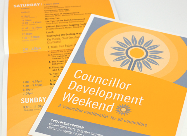
MAV publications suite
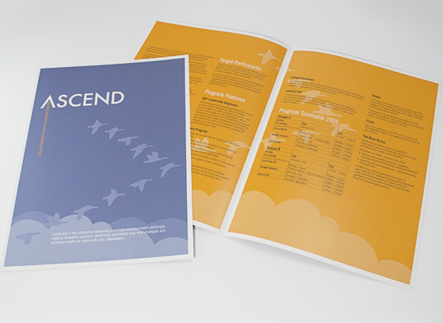
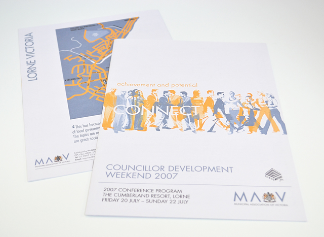
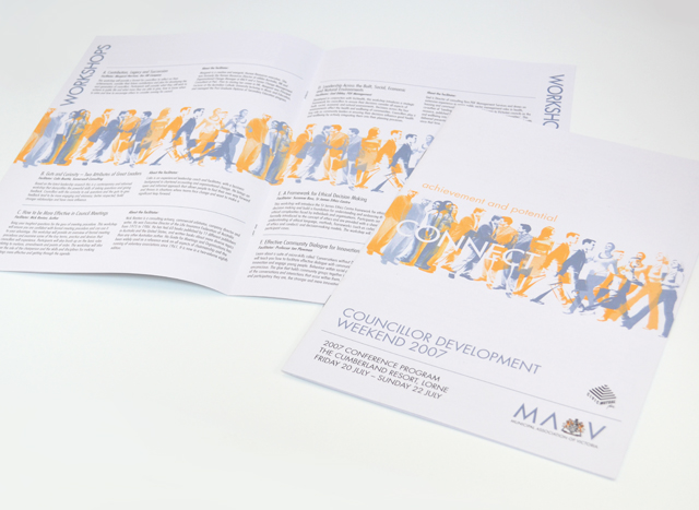
Use of two colours and bold graphics made a varied suite of printed material a unified group. We created strong vector elements to inject interest in corporate collateral promoting professional development programs, conferences and initiatives. Concentrating on yellow and silver blue, this unusual approach to corporate communications took tight timing and scarce photographic resources out of the equation, creating an identity with a bold graphic language.
Other work
-
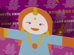
Worldly Weddings exhibition
The idea of paper dolls combines with our signature in-house illustration style to make a […]
VIEW PROJECT -
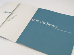
One Umbrella annual report
People working for other people was the focus of this annual report for a food […]
VIEW PROJECT -
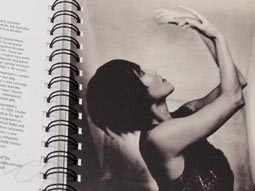
Australian Ballet diaries
Exposure to the lesser known life behind-the-scenes of the Australian Ballet was the purpose of […]
VIEW PROJECT -
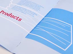
Nadavoc hand-assembling service
Nadavoc creates work for people with disabilities. To engage potential clients with this unique organisation, […]
VIEW PROJECT