Our work
Back to projectsSinclair Walker identity
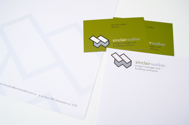
This sophisticated identity is based on the humble brick. Three colours offer the stationery set variety and space within its smart uniformity.
Other work
-

Alex Fraser Group
Trucks are the most visible part of the company. We took an ever-present element, the […]
VIEW PROJECT -

Queen Elizabeth Centre
The Queen Elizabeth Centre provides support, care and education to families. Describing this important goal […]
VIEW PROJECT -

Spencer & Nash stationery
Visual identity for a boutique stationery maker. The modern yet elegantly detailed ethos of the […]
VIEW PROJECT -

LGPro Awards books
Creating fresh themes about people and their achievements was the brief for these annual awards […]
VIEW PROJECT

