Our work
Back to projects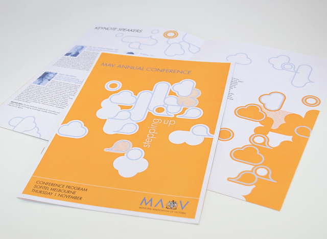
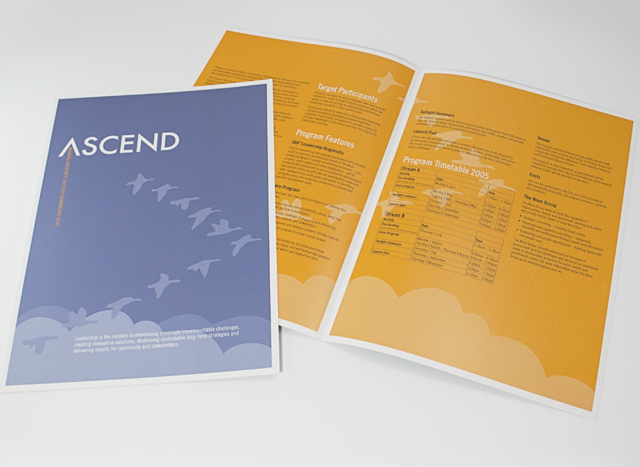
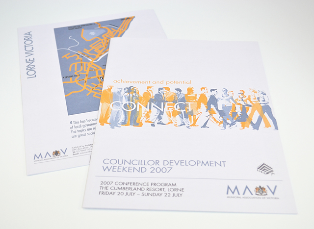
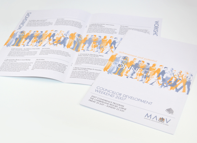
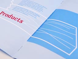
MAV publications suite
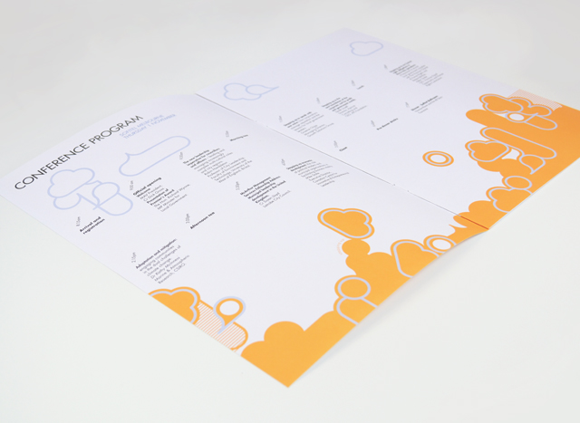
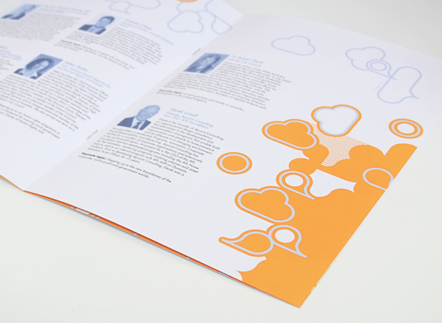
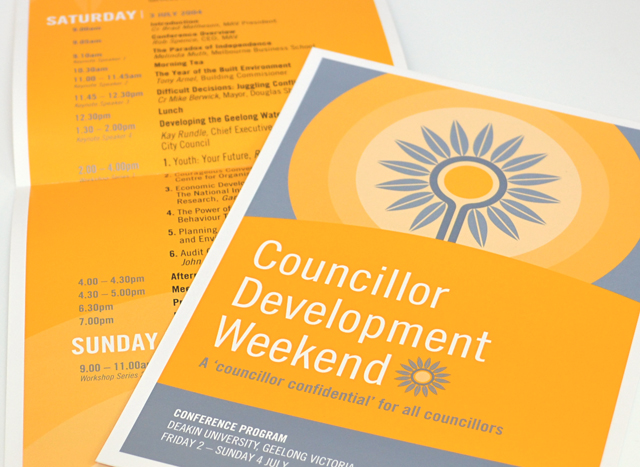
Use of two colours and bold graphics made a varied suite of printed material a unified group. We created strong vector elements to inject interest in corporate collateral promoting professional development programs, conferences and initiatives. Concentrating on yellow and silver blue, this unusual approach to corporate communications took tight timing and scarce photographic resources out of the equation, creating an identity with a bold graphic language.
Other work
-

-
Westmoor Property identity
Colour can take a front seat without being overpowering. Employing a soft yellow to contrast […]
VIEW PROJECT -
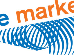
Finance Market identity
The Finance Market brand uses the idea of money as its identity. The stylised graphic […]
VIEW PROJECT -
Nadavoc hand-assembling service
Nadavoc creates work for people with disabilities. To engage potential clients with this unique organisation, […]
VIEW PROJECT