Our work
Back to projects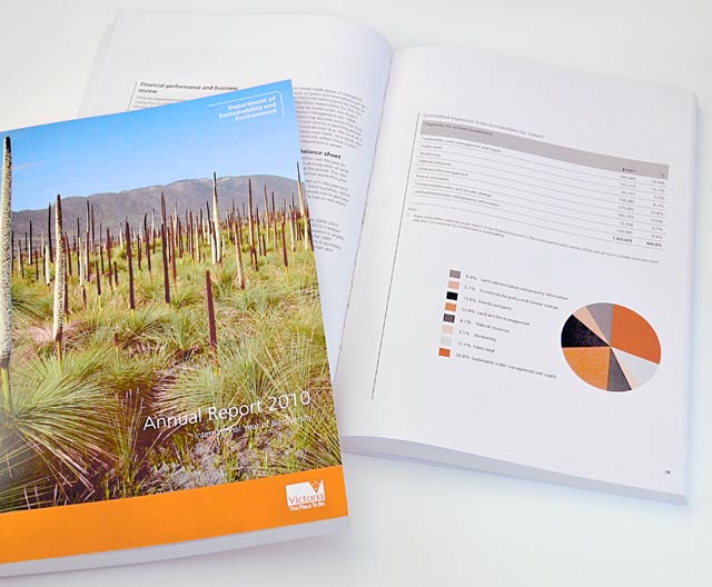
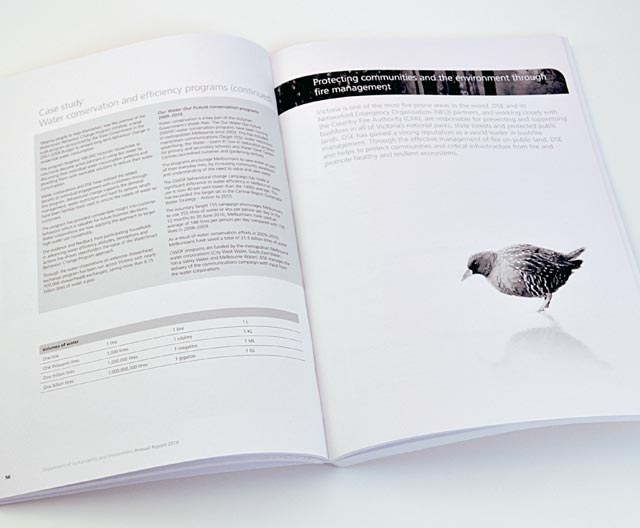
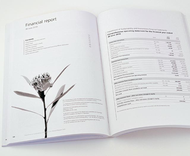
DSE annual report
Clean, clear sections with generous use of space create easy to find points of navigation and rest for the reader. Most of the document was produced in black and white as a cost responsibility measure. We used this simplicity to feature isolated images of birds and plant life, reinforcing the important goals of the Department of Sustainability and Environment.
Other work
-
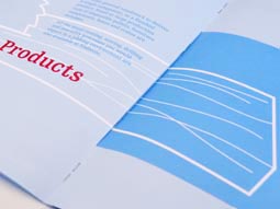
Table Wrap events
Tablewrap organise and present unique and memorable events. This brochure, presented to their prospective clients, […]
VIEW PROJECT -

Arts Centre Ready Steady Go!
This fond glimpse at the early days of rock ’n’ roll in Australia, features the […]
VIEW PROJECT -
Nadavoc hand-assembling service
Nadavoc creates work for people with disabilities. To engage potential clients with this unique organisation, […]
VIEW PROJECT -

HappyGreen identity
Presenting an approachable and friendly image are essential traits for retailers. When you add green […]
VIEW PROJECT