Our work
Back to projects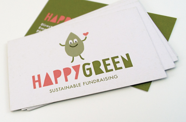
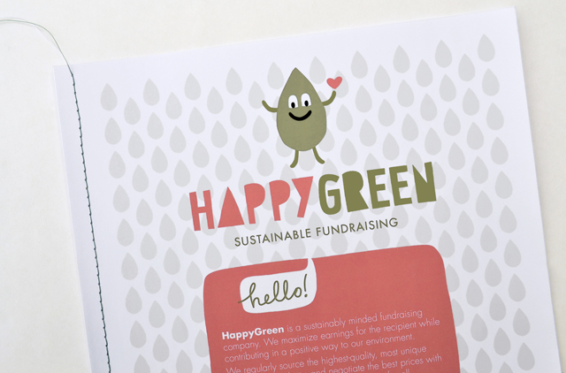
HappyGreen identity
Presenting an approachable and friendly image are essential traits for retailers. When you add green credentials the image has to present those attributes in an even more carefully defined way. That doesn’t create a restriction; quite the opposite for HappyGreen. An incredibly simple hand drawn character and type solution brand this unique, sustainable fundraising initiative.
Other work
-

DSE annual report
Clean, clear sections with generous use of space create easy to find points of navigation […]
VIEW PROJECT -

Slumber Dry identity
We created an identity that develops a straightforward product further, to reassure the parents purchasing […]
VIEW PROJECT -

Mimco mag
This publication contained a catalogue and was used as an introduction to the company at […]
VIEW PROJECT -

Spencer & Nash stationery
Visual identity for a boutique stationery maker. The modern yet elegantly detailed ethos of the […]
VIEW PROJECT