Our work
Back to projectsSinclair Walker identity
This sophisticated identity is based on the humble brick. Three colours offer the stationery set variety and space within its smart uniformity.
Other work
-
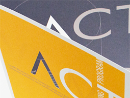
ACT flyer
Typography is often an under utilised element in pieces of communication. Making more of the […]
VIEW PROJECT -
Westmoor Property identity
Colour can take a front seat without being overpowering. Employing a soft yellow to contrast […]
VIEW PROJECT -

Slumber Dry identity
We created an identity that develops a straightforward product further, to reassure the parents purchasing […]
VIEW PROJECT -

Mimco mag
This publication contained a catalogue and was used as an introduction to the company at […]
VIEW PROJECT