Our work
Back to projects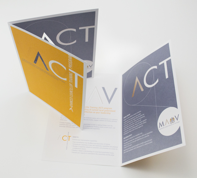
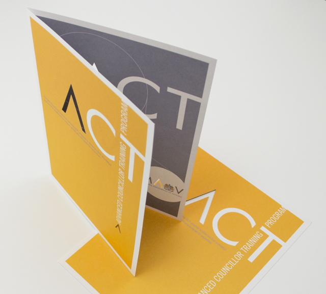
ACT flyer
Typography is often an under utilised element in pieces of communication. Making more of the words on paper builds-in their meaning and purpose. Creating the identity for a program in this way also reduces the need for additional elements. The pièce de résistance was forme cutting the A graphic through both pages. This delivered a strong character for this piece that reinforces the A’s recurring presence through the suite of documents we have created for the MAV.
Other work
-
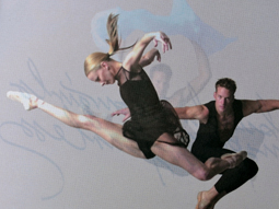
Australian Ballet Bodytorque
This program to engage supporters of the Australian Ballet, uses mesmerising images of the dancers […]
VIEW PROJECT -
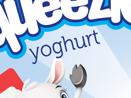
Yoplait Squeezie packaging
Distilling and presenting the most important elements in a consumer friendly design, we organised and […]
VIEW PROJECT -
Bouncing Back booklet
Bouncing Back is designed for parents and children who have experienced family violence. The booklet […]
VIEW PROJECT -
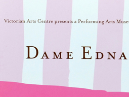
Dame Edna book
There is style and glamour, and then there is Dame Edna. Telling the Edna story […]
VIEW PROJECT