Our work
Back to projects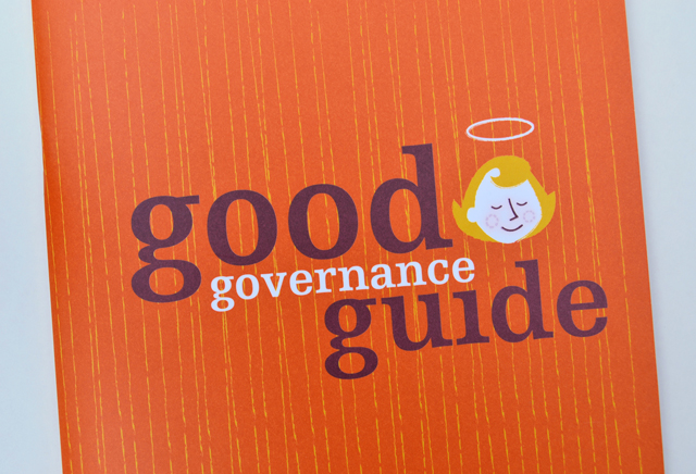
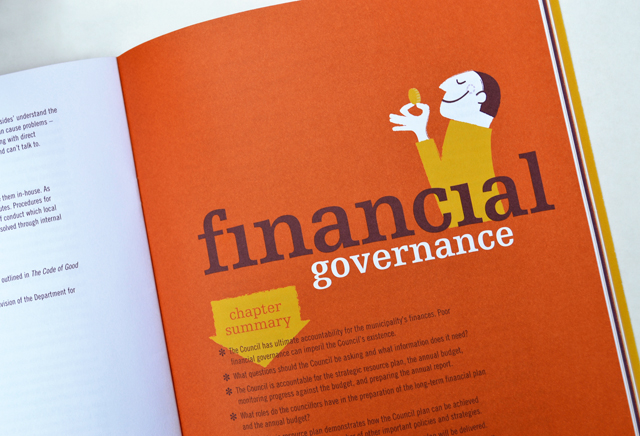
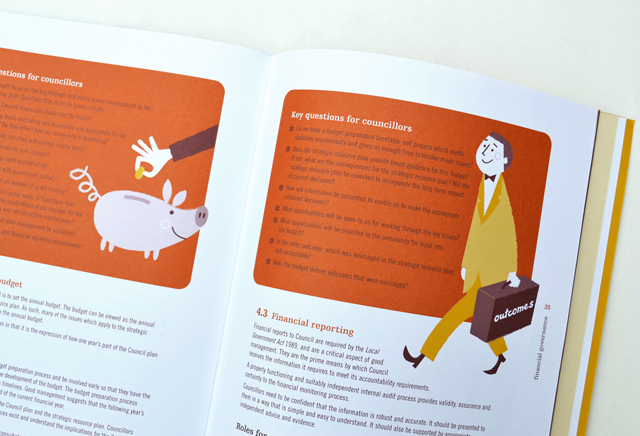
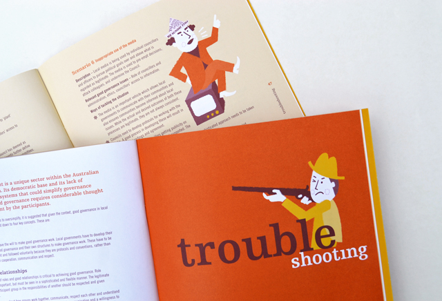
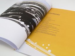
MAV Good Governance Guide
By injecting a healthy dose of personality, an extensive manual on governance is able to hold the reader, section after section, with refreshing original illustrative introductions and feature panels. These elements are partnered with typography that keep the information lively and accessible. High demand by members has led to several reprints of this publication.
Other work
-

Back to Action chiropractic
A strong, vital image for a sports-oriented chiropractic organisation.
VIEW PROJECT -
Melbourne Water flood management strategy
Strong and beautiful photography was complimented with expansive areas of colour linked by a bold […]
VIEW PROJECT -
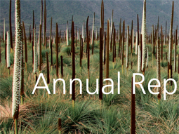
DSE annual report
Clean, clear sections with generous use of space create easy to find points of navigation […]
VIEW PROJECT -
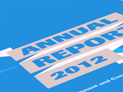
RCSA annual report
Annual reports are the opportunity to push the established look of an organisation beyond the […]
VIEW PROJECT