Our work
Back to projects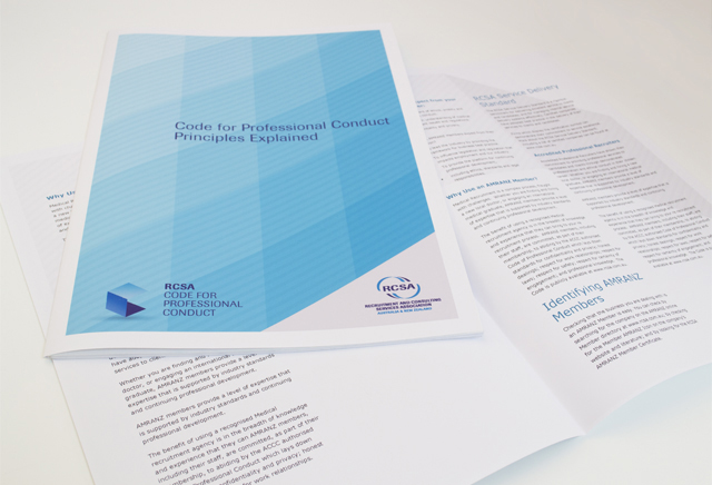
RCSA publications
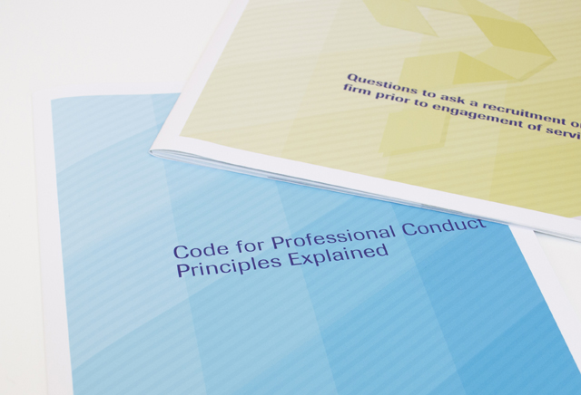
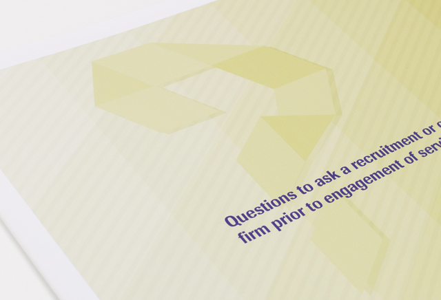
We did not use a light touch when it was time for an update to the corporate communications of this recruitment association. The client’s existing dated ribbon device was modernised into graphic shapes with graduated colour. These simple elements expanded into different graphic interpretations for a striking suite of documents. An annual report, code of practice booklet and industry brochures were also created, sharing this bright yet corporate look, moving perception of the organisation forward with a modern progressive energy.
Other work
-

Arts Centre education programs
The extensive programs for schools offered by the Arts Centre Melbourne required clear, well defined […]
VIEW PROJECT -
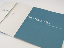
One Umbrella annual report
People working for other people was the focus of this annual report for a food […]
VIEW PROJECT -

Watershed carwash café
Creating an identity for a carwash that wanted to bring the café part of the […]
VIEW PROJECT -

Alex Fraser Group
Trucks are the most visible part of the company. We took an ever-present element, the […]
VIEW PROJECT