Our work
Back to projects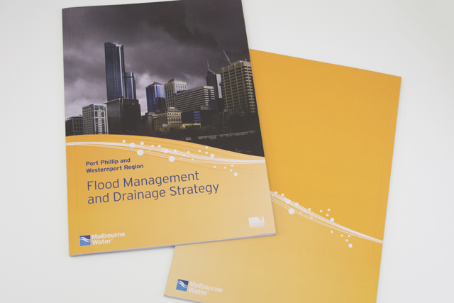
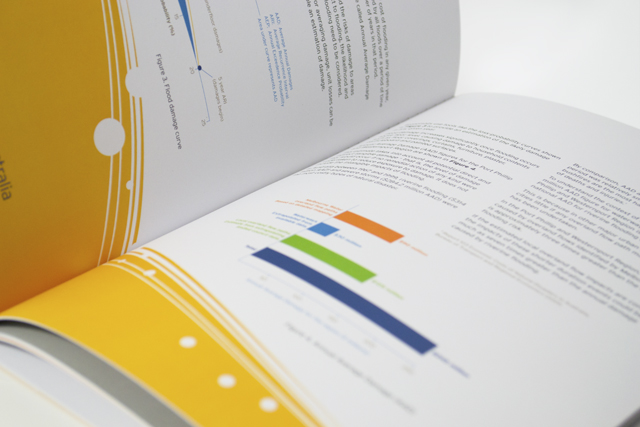
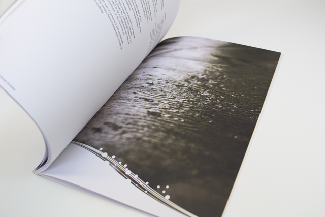
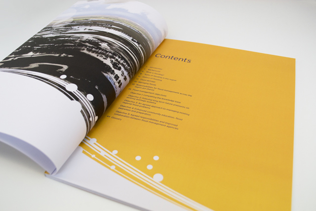
Melbourne Water flood management strategy
Strong and beautiful photography was complimented with expansive areas of colour linked by a bold recurring graphic edge of stylised water. This spacious layout makes what could have been a dry read into an appealing mix of history, social and economic planning.
Other work
-

Arts Centre education programs
The extensive programs for schools offered by the Arts Centre Melbourne required clear, well defined […]
VIEW PROJECT -

Back to Action chiropractic
A strong, vital image for a sports-oriented chiropractic organisation.
VIEW PROJECT -

Bouncing Back booklet
Bouncing Back is designed for parents and children who have experienced family violence. The booklet […]
VIEW PROJECT -
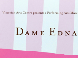
Dame Edna book
There is style and glamour, and then there is Dame Edna. Telling the Edna story […]
VIEW PROJECT