Our work
Back to projectsBack to Action chiropractic
A strong, vital image for a sports-oriented chiropractic organisation.
Other work
-
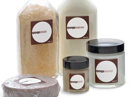
Sponge natural cosmetics
A pure and clean experience with the authority of research is the promise of this premium […]
VIEW PROJECT -
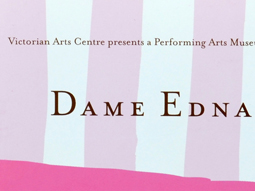
Dame Edna book
There is style and glamour, and then there is Dame Edna. Telling the Edna story […]
VIEW PROJECT -

Polish consulting
A logograph is the visual representation of a word. For the Polish identity, this technique […]
VIEW PROJECT -

Sinclair Walker identity
This sophisticated identity is based on the humble brick. Three colours offer the stationery set […]
VIEW PROJECT