Our work
Back to projects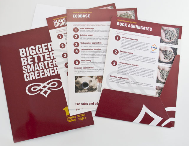
Alex Fraser Group
Trucks are the most visible part of the company. We took an ever-present element, the traditional pinstriping scroll on truck paintwork and made it their signature. Within an industry full of conventional geometric identities, a unique brand was created. For this long established civil construction supplier, the message of who they were and what the Alex Fraser Group offered, was best served with design that projected the strength of the organisation and its product, to its own people and its clients. The communication material we created built on the bold and simple graphics with straight talking, simple headlines for recruitment and sales promotion.
Other work
-
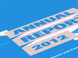
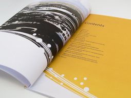
RCSA annual report
Annual reports are the opportunity to push the established look of an organisation beyond the […]
VIEW PROJECT -

Pivot Home Loans identity
Responsible yet friendly. The Pivot Home Loans identity uses colours, fonts and graphics that don’t […]
VIEW PROJECT -
Melbourne Water flood management strategy
Strong and beautiful photography was complimented with expansive areas of colour linked by a bold […]
VIEW PROJECT -
Nadavoc hand-assembling service
Nadavoc creates work for people with disabilities. To engage potential clients with this unique organisation, […]
VIEW PROJECT