Our work
Back to projects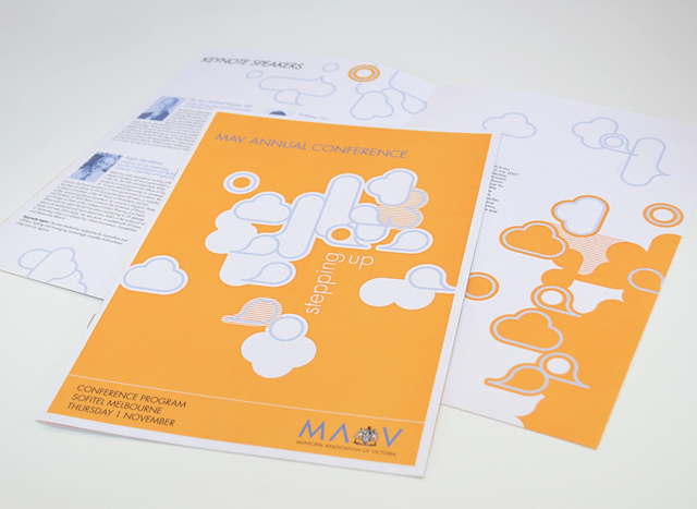
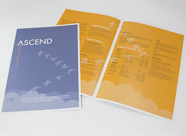
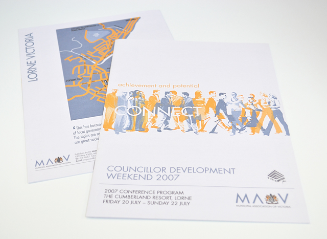
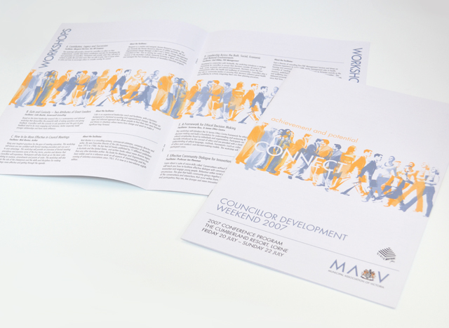
MAV publications suite
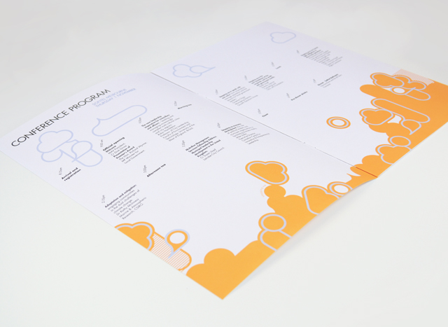
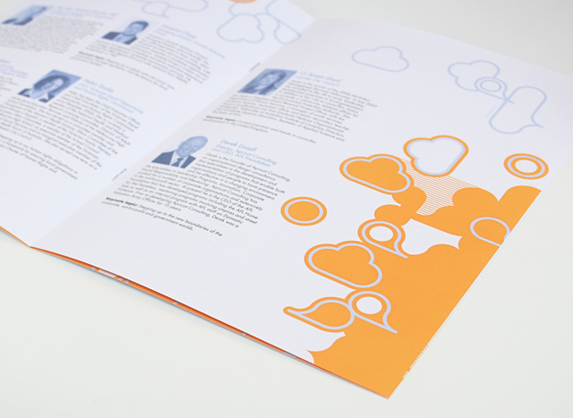
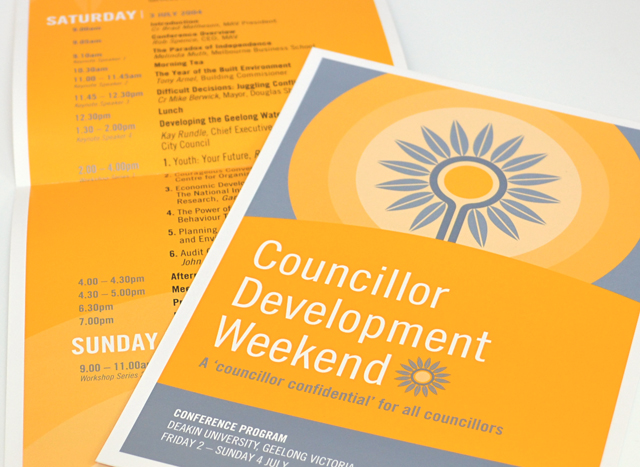
Use of two colours and bold graphics made a varied suite of printed material a unified group. We created strong vector elements to inject interest in corporate collateral promoting professional development programs, conferences and initiatives. Concentrating on yellow and silver blue, this unusual approach to corporate communications took tight timing and scarce photographic resources out of the equation, creating an identity with a bold graphic language.
Other work
-

Sinclair Walker identity
This sophisticated identity is based on the humble brick. Three colours offer the stationery set […]
VIEW PROJECT -
Range rollouts
Maintaining and extending established brands with new SKUs, new feature information and promotions requires a […]
VIEW PROJECT -

Mimco mag
This publication contained a catalogue and was used as an introduction to the company at […]
VIEW PROJECT -
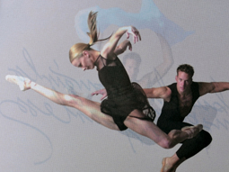
Australian Ballet Bodytorque
This program to engage supporters of the Australian Ballet, uses mesmerising images of the dancers […]
VIEW PROJECT