Our work
Back to projects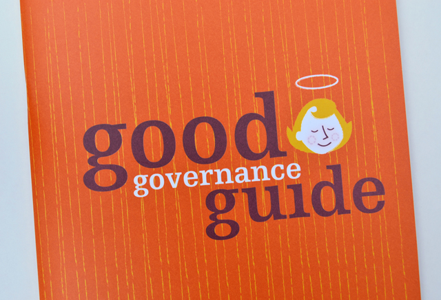
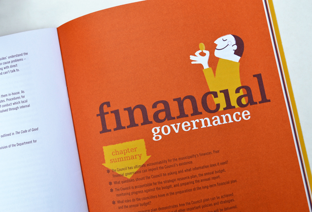
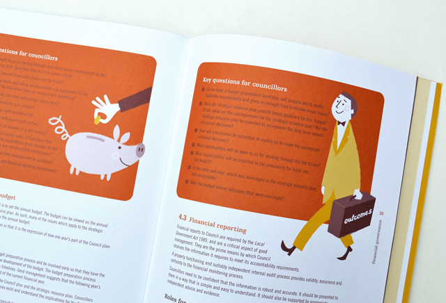
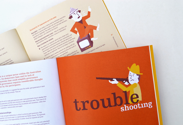
MAV Good Governance Guide
By injecting a healthy dose of personality, an extensive manual on governance is able to hold the reader, section after section, with refreshing original illustrative introductions and feature panels. These elements are partnered with typography that keep the information lively and accessible. High demand by members has led to several reprints of this publication.
Other work
-

Polish consulting
A logograph is the visual representation of a word. For the Polish identity, this technique […]
VIEW PROJECT -
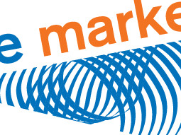
Finance Market identity
The Finance Market brand uses the idea of money as its identity. The stylised graphic […]
VIEW PROJECT -
Queen Elizabeth Centre
The Queen Elizabeth Centre provides support, care and education to families. Describing this important goal […]
VIEW PROJECT -

Bouncing Back booklet
Bouncing Back is designed for parents and children who have experienced family violence. The booklet […]
VIEW PROJECT