Our work
Back to projects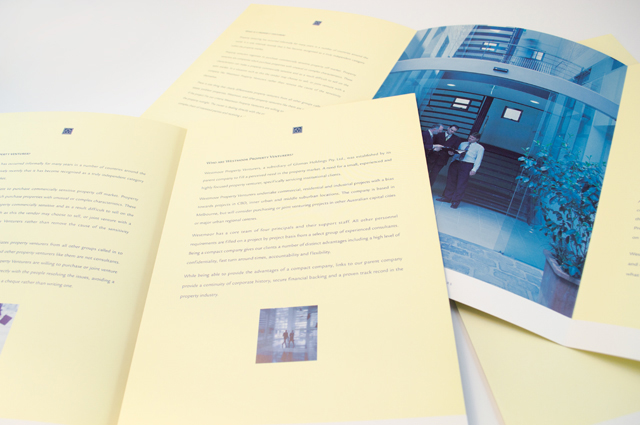
Westmoor Property identity
Colour can take a front seat without being overpowering. Employing a soft yellow to contrast with the strong logo device and type solution, delivers an identity that creates space between itself and the competition right from the outset. A conservative flamboyance.
Other work
-
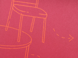
Table Wrap events
Tablewrap organise and present unique and memorable events. This brochure, presented to their prospective clients, […]
VIEW PROJECT -
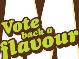
Big M on-pack promotions
This iconic brand maintains interest from existing and new customers through seasonal promotions. Instantly exciting consumers […]
VIEW PROJECT -

HappyGreen identity
Presenting an approachable and friendly image are essential traits for retailers. When you add green […]
VIEW PROJECT -
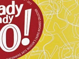
Arts Centre Ready Steady Go!
This fond glimpse at the early days of rock ’n’ roll in Australia, features the […]
VIEW PROJECT